We’d like to know more about Jean Henri. Have you always called Tasmania home? How did the Saint Pierre brand come to be?
I think Tasmania has always been home, regardless of where I’ve found myself around the world. There’s something magnetic about the island for many people that have lived or even visited. Saint Pierre owes much to my childhood, as well as Tasmania’s cultural and natural elements, as inspiration. I was raised in a home that championed artistry in many forms, as were my parents – I spent a lot of my childhood surrounded by nature, and my parents often encouraged me to create with raw ochres and subtle pigments derived from local flora. Although my rebellious younger years distracted me for a time, I suppose both the arts and the island were always my home in a way.
With artists as parents, was creativity a large part of your upbringing? Has following in their footsteps and creating art been something you’ve always wanted to do, or did your goals change throughout your childhood and into adulthood?
My father was an arts educator for as long as I can remember, until his retirement. My mother has always been very involved in textile arts, featuring in several international publications, and selling her works worldwide. I remember our family home being full of music and creativity, along with the rugged nature of farm life. Growing up in a small island town meant that I could continue on the farm, become a fisherman, or undertake other, less savoury, career paths. Wanting none of that, I moved out at 15 to study art simply because I had no idea what I was doing. It was a significant juncture in my young life that ultimately led to where I am today.
Do you have formal training as an artist? Where and what did you study?
I have formal training, but I disliked most of that undertaking, so I probably shouldn’t go into who I studied under or where! I craved technical skills and material knowledge, but my studies mainly consisted of relentless theory and a requirement for everything to have some obscure, hidden meaning. I suppose this ultimately led to extensive exploration of different mediums, including inks, aquarelles and gouache. Even if I was the brooding teenager in a dark studio, I did find some comfort in losing hours to discovering how different materials worked with or against one another.
You’ve mentioned experience with creating your own pigments using organic materials, and we’ve previously discussed that a lot of your colors are based on similarly handcrafted pigments from the Luberon region in France. Do you prefer working with naturally derived materials? What is your preferred medium –inks, gouache, traditional watercolor, or something else entirely?
When I talk about ochres, it’s hard not to mention the Luberon, the heart of Provence, and the Ochre quarry in Gargas. A family business there, the “Société des Ocres de France,” has transformed ochre ore into pure ochre since 1901. They produce about 1,000 tons of material annually, and export about 60% of their products. Still, smaller operations and much younger businesses are releasing such lovingly crafted pigments that are a dream to create with.As much as I could go on forever about such high-quality materials, I think my favorite medium is actually water itself. I’ve completed many series that barely had any pigment, or were just strategically dampened sheets of heavy paper. To me, how water determines its own path on a surface and how it carries material within itself is entirely baffling – it’s only possible for me to control it to a certain extent. Every application has a unique fingerprint that is only partially my creation.
We see inspiration from nature reflected in the colours that you choose, but what else inspires you to create? Are there other artists, past or present, that you draw inspiration from?
My mother is also an inspiration for me, even if her medium choice is different from mine. Her process involves dyeing fabrics using natural materials and found metal objects that produce delicate colors and shadows. She’s refined her art over many years and achieved worldwide recognition for her efforts.
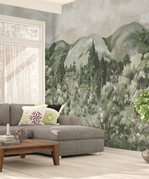
My grandfather was also a keen painter, and I have several of his artworks hanging in my studio. While he explored a variety of mediums, his watercolor studies are my favorites. Besides my family, Philip Wolfhagen’s dream landscapes are incredibly immersive for me. The immutable qualities he seeks in works like his Untitled Panorama series provide an accurate depiction of his home, Tasmania.
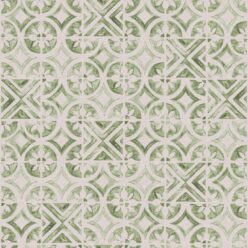
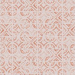
Taking color inspiration (and materials) from nature means your choices are essentially endless – so how do you settle on a particular palette for a design?
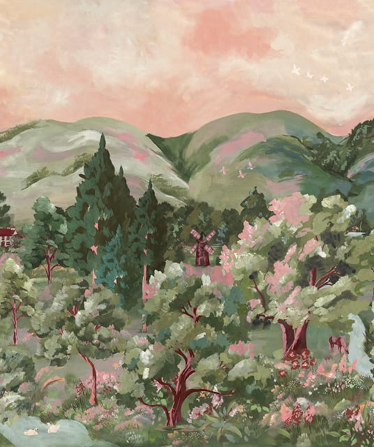
Most of the time, specifically for patterns, I prefer to work in various tones, tints or shades rather than hues. The pigment and water combine to make a lot of the choices for me, but I have control over where and how it can flow. If I am pairing hues, I rely heavily on color theory, which has apparently been burned into my brain since undertaking my studies. I try to either play with contrast to promote vibrancy or complement with subtle shifts in color. Ultimately, since many of my pigments find their origins in nature, I can look at how they exist in reality and determine what other hues choose to live in their shared natural environment.

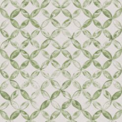
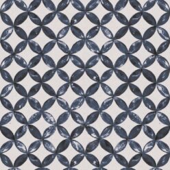
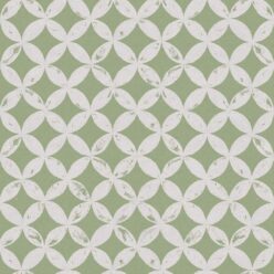
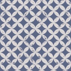
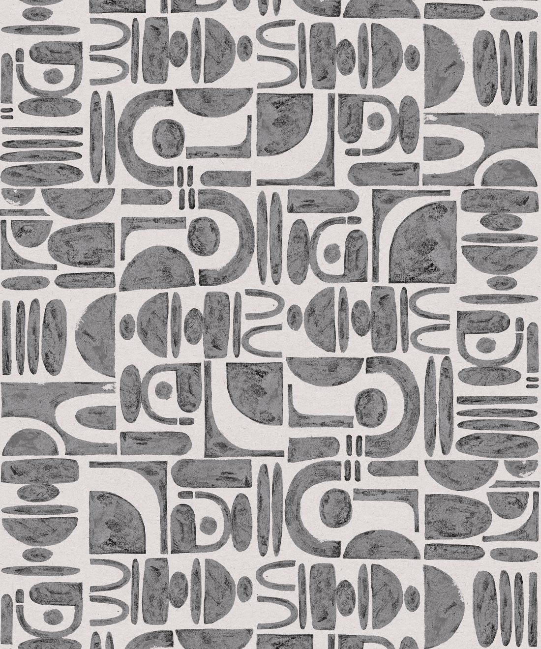
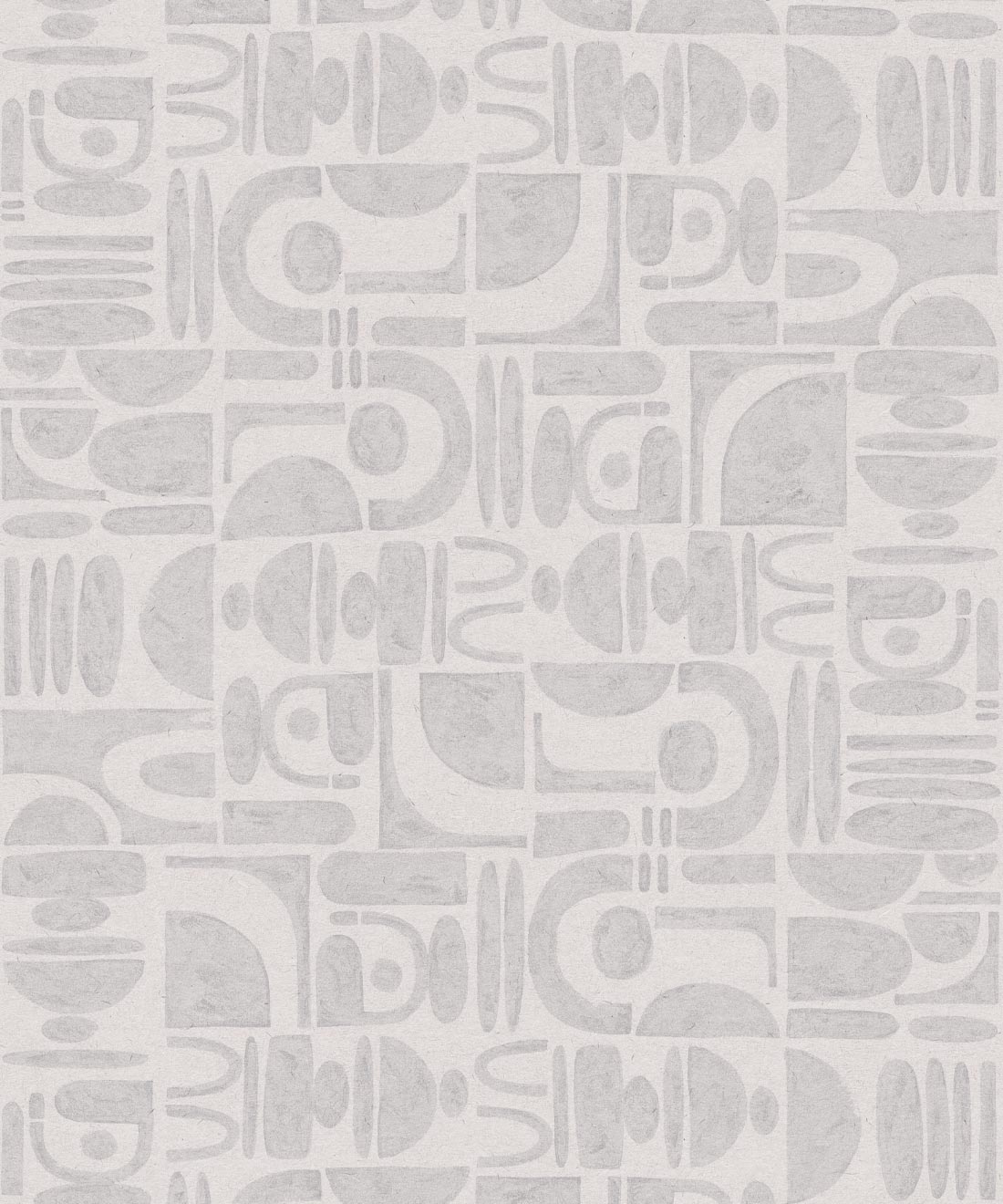
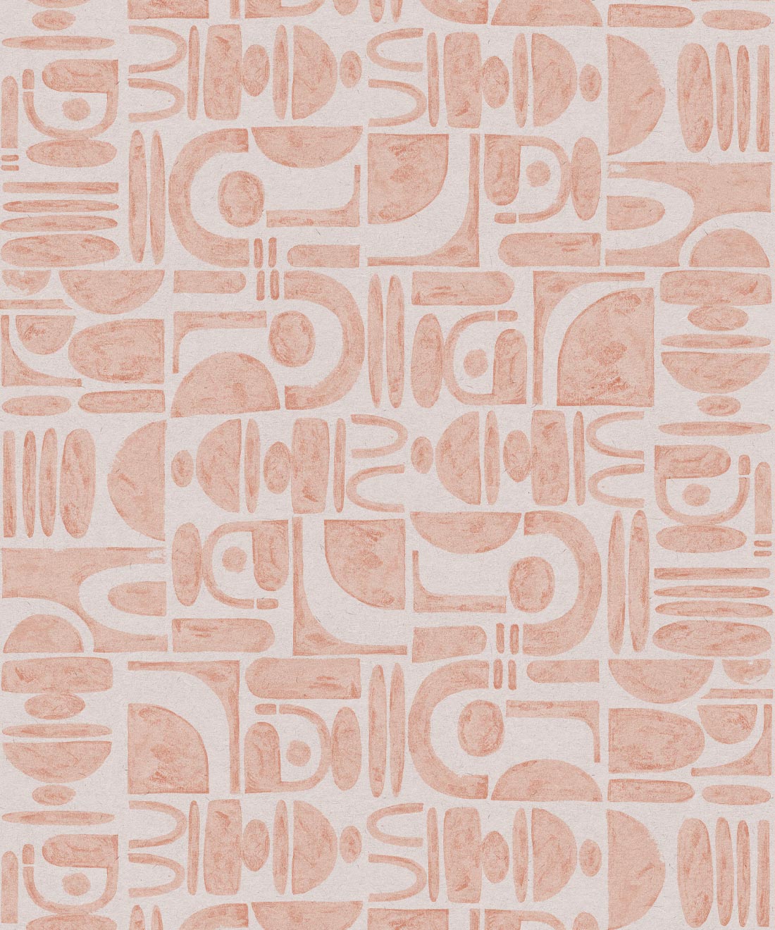
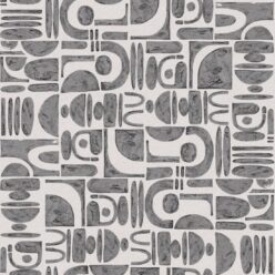
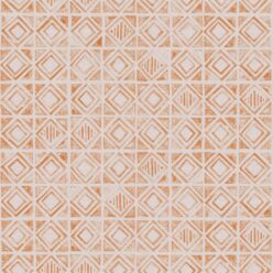
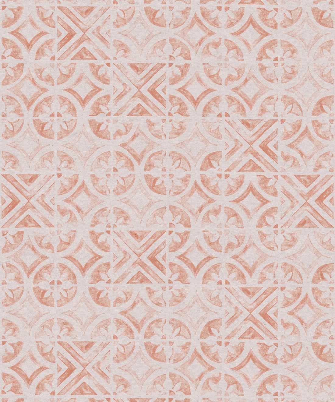
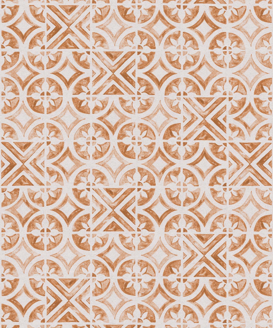
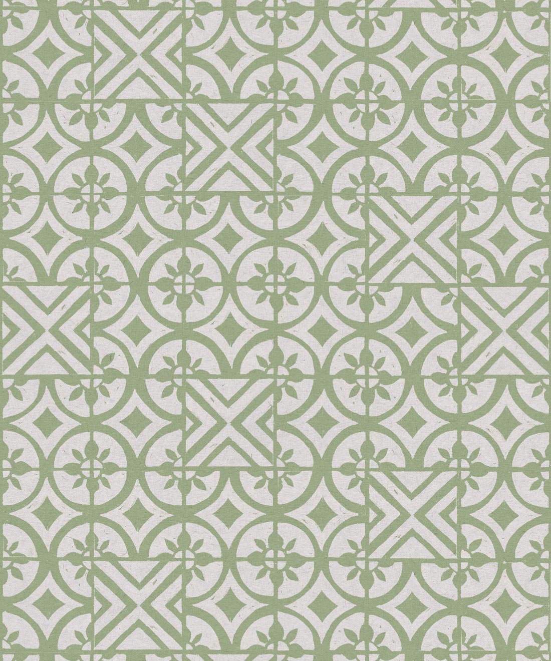
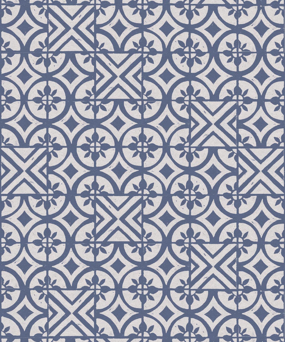
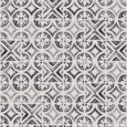
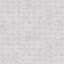
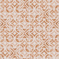
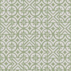
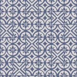
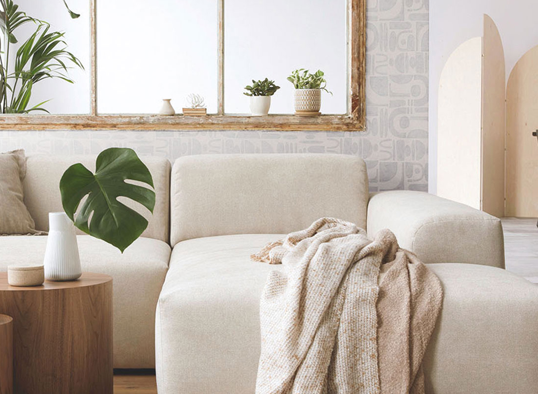
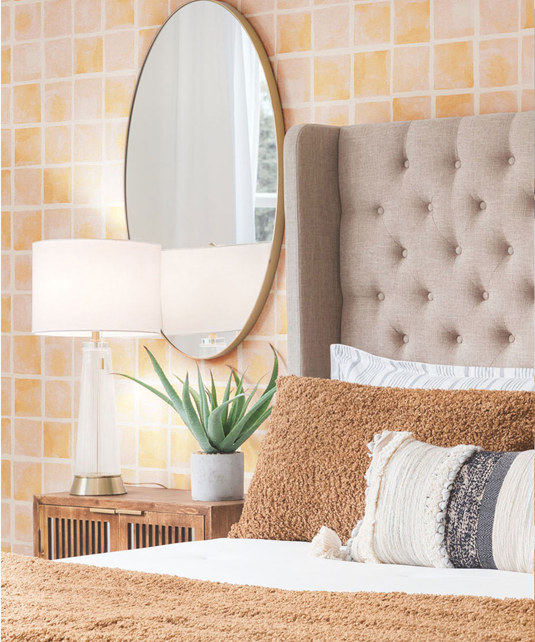
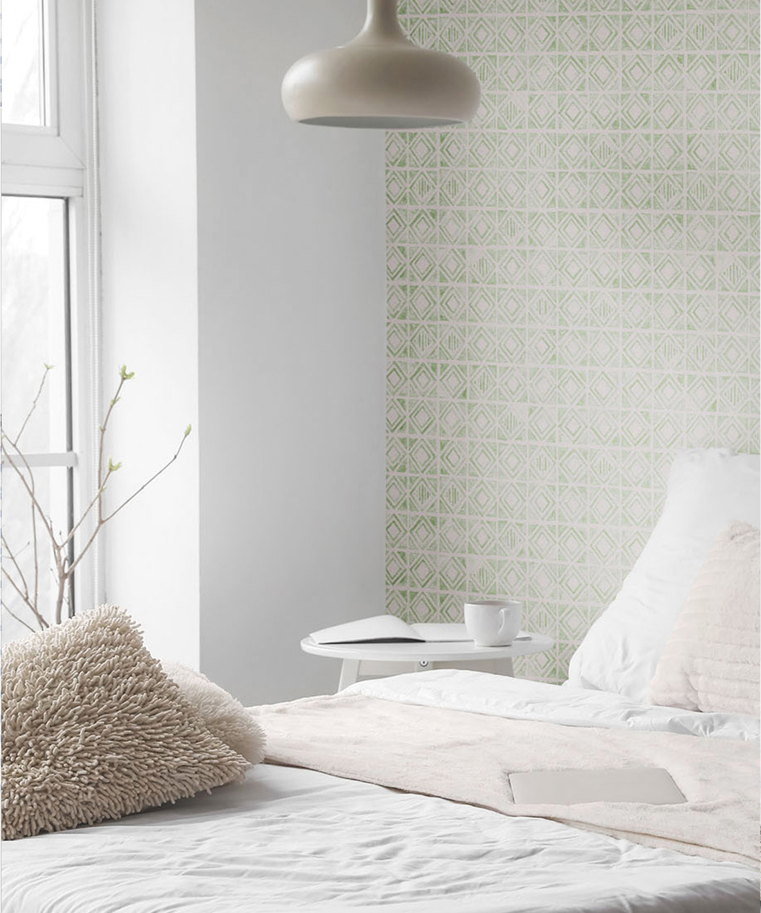
Saint Pierre as a brand focuses on the perfectly imperfect –crooked shapes, uneven texture, colour variations; how does this concept play into your creative process? A lot of artists will pore over an artwork until it’s deemed complete–do your artworks still give you that sense of satisfaction at having finished something, even though they’re not what many would call perfect?
Perfection is, as I think many have found, entirely relative. In art, determining whether something is finished or unfinished is up to the artist or viewer. Design is a little different since everything must be rationalized, and I feel my patterns border between both definitions. Look at concept art, for example. Some might argue it appears unfinished, although its intention is not to be a refined piece but to convey enough of a feeling to produce the idea it represents. A supporting act, if you will. I’ve always considered my patterns to be the same. I don’t want them to overpower a room but instead support it in its entirety.
How does it feel to see your designs as wallpaper? Has pattern design been a large component of your portfolio prior to this collaboration, or is it something that you created specifically for your collection with Milton & King?
I’m honoured that anyone would choose something I’ve created in their home! I think I kind of stumbled into pattern design, really. Thinking back, I can determine the beginning as only an element of other design projects. We’d need a pattern for the background of another print design or a texture for a wall in mockups, and I’d put together something we could utilize. Trialing various designs meant many iterations were set aside, and I remember feeling wasteful, like there was potential going unused. I’d set aside time to refine them and make more specific choices based on their individual design; decisions relevant to the project they were initially intended for.
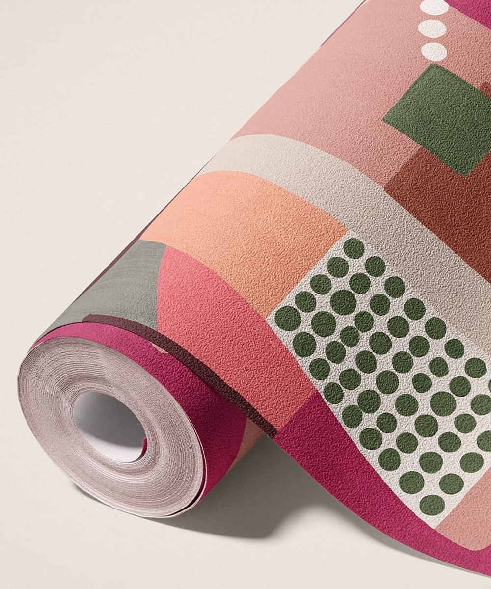
Of the collection you’ve launched with us, do you have a favorite design? Which designs are you most looking forward to seeing styled in homes and businesses across the world?
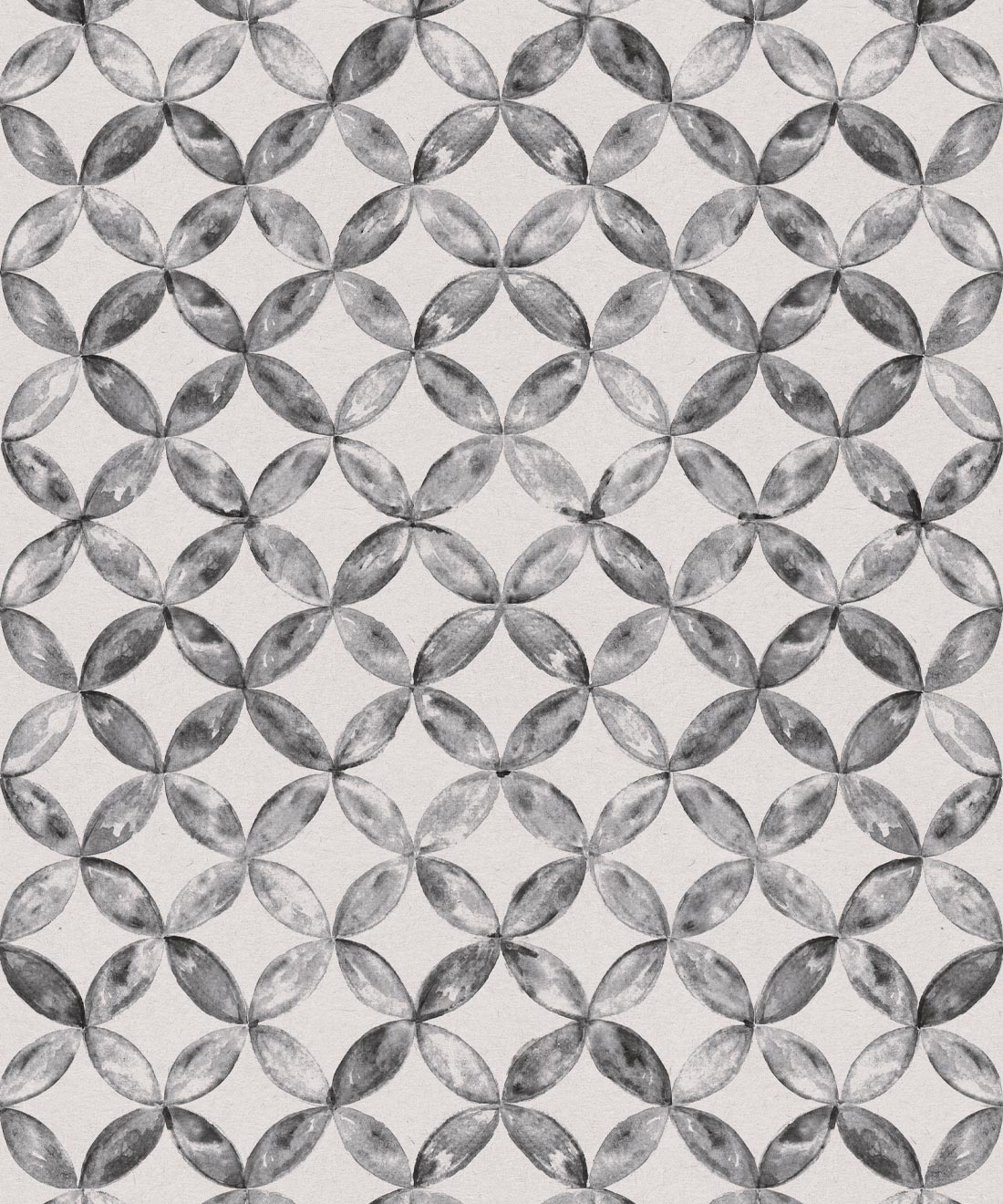
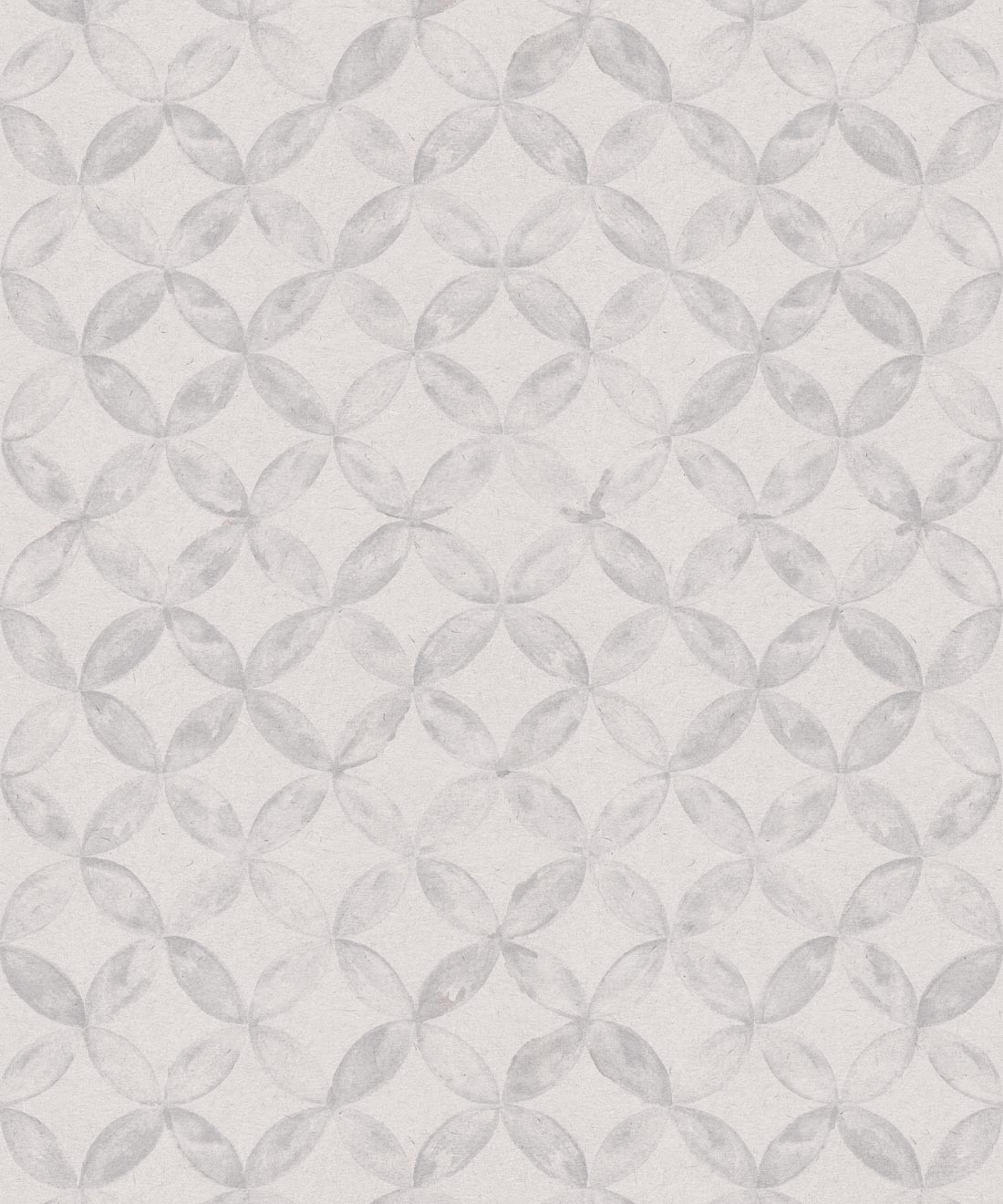
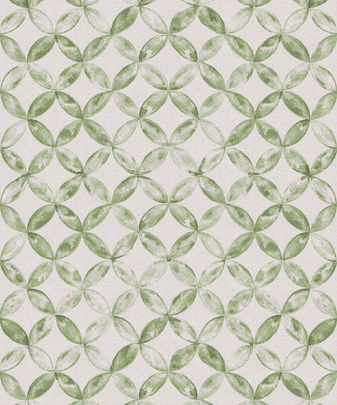
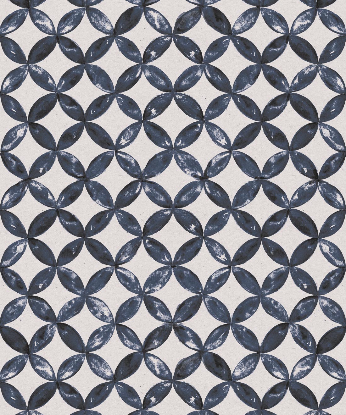
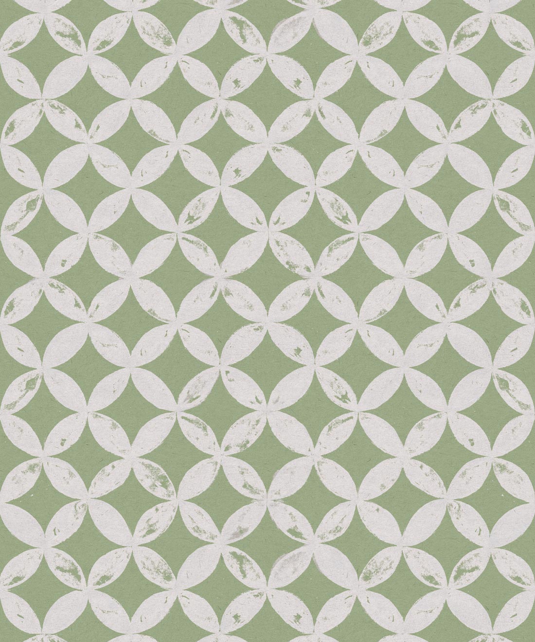
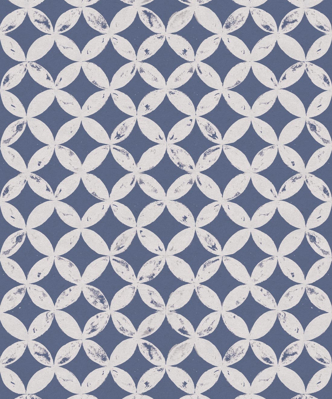
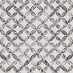
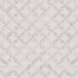
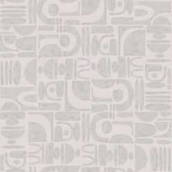
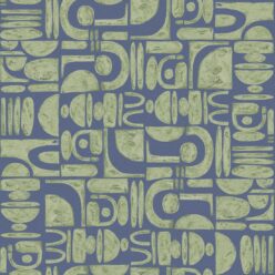
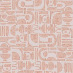
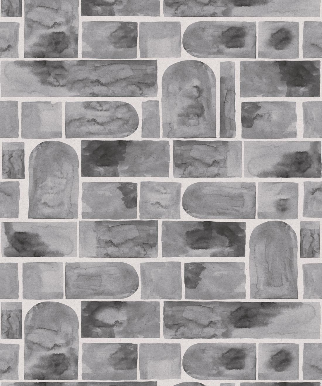
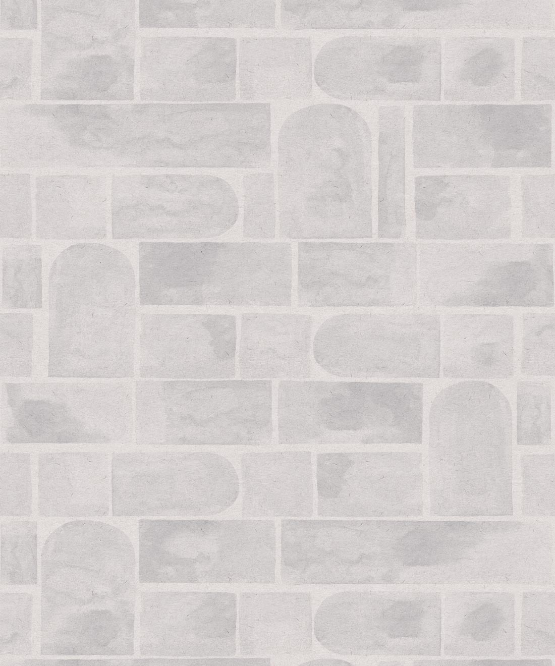
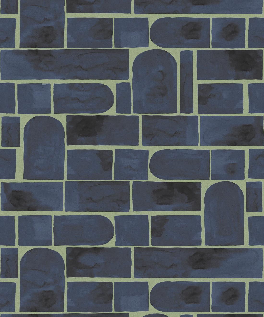
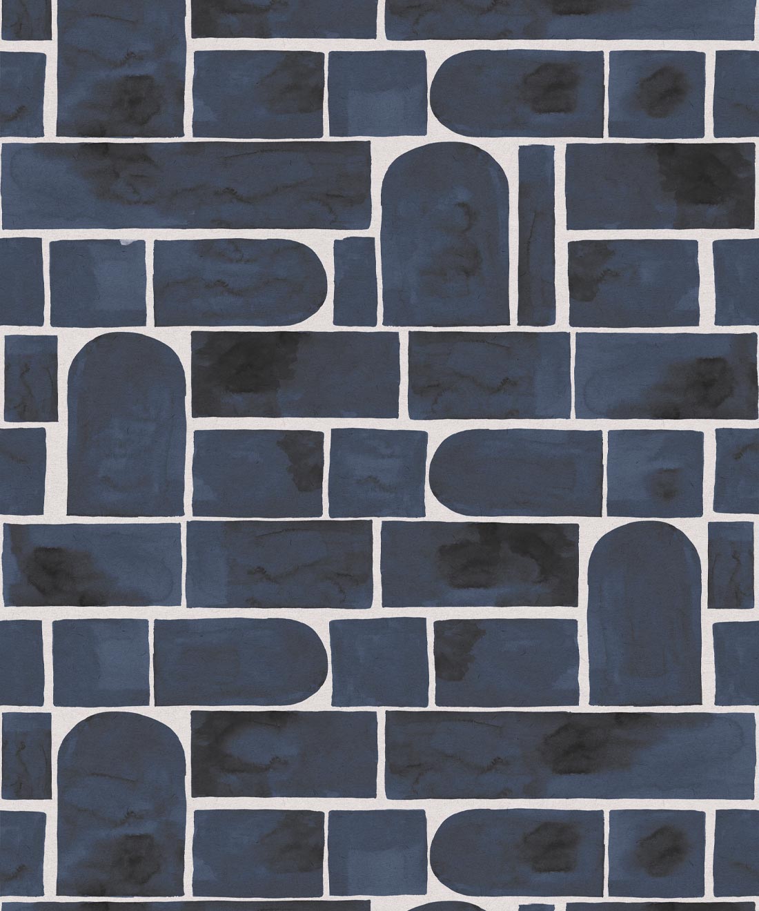
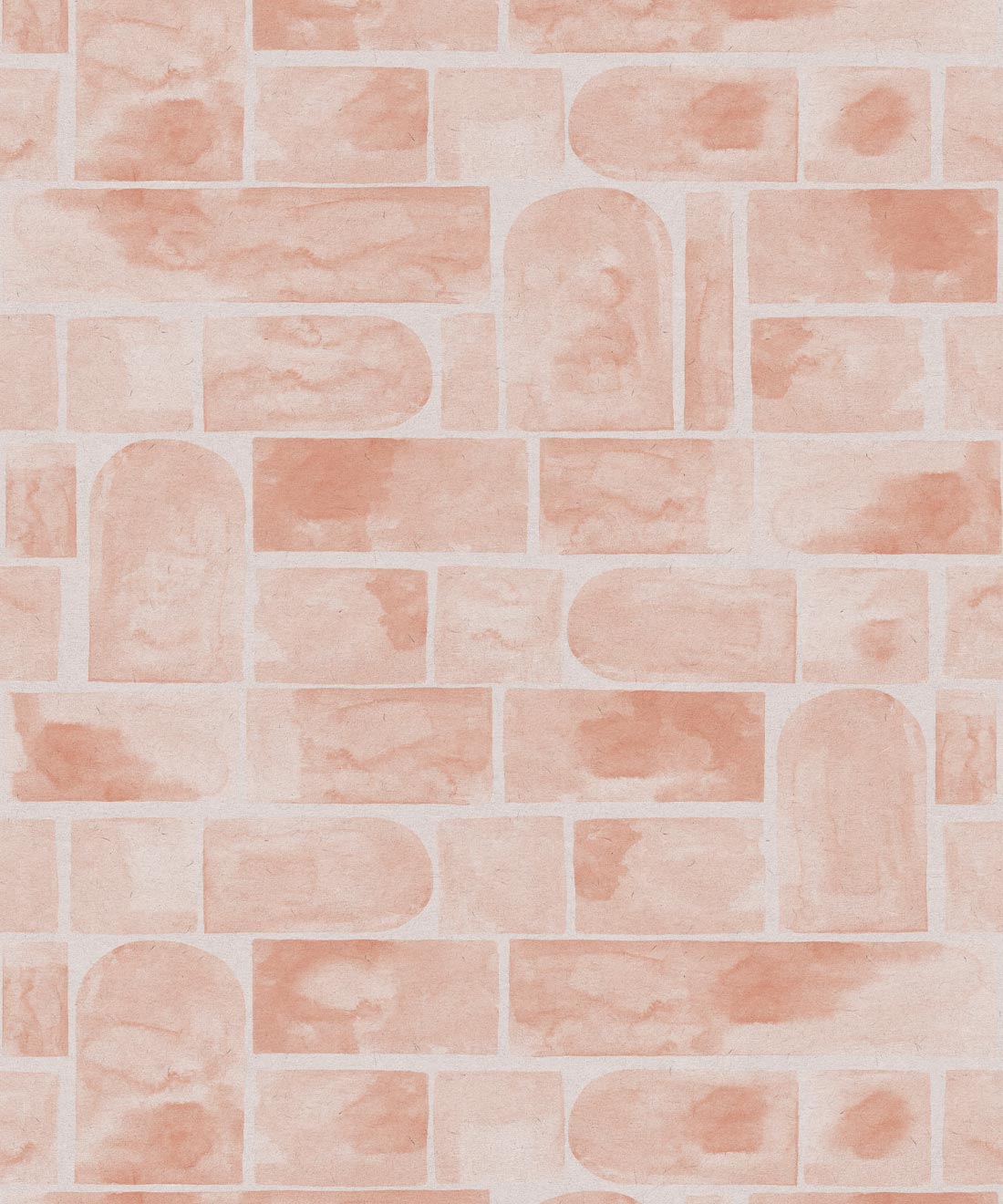
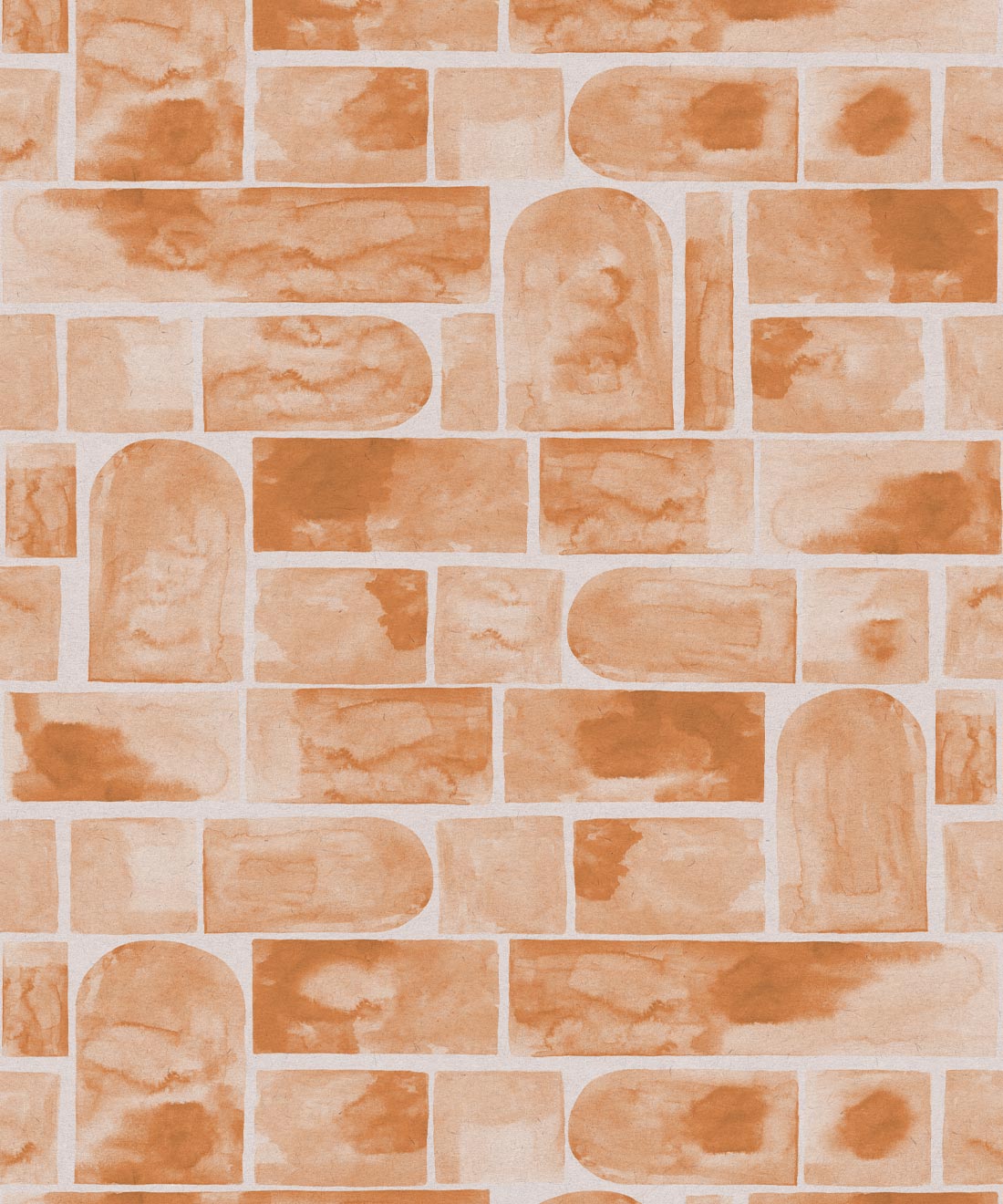
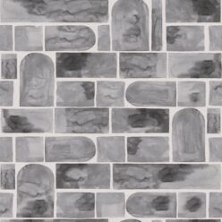
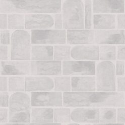
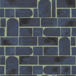
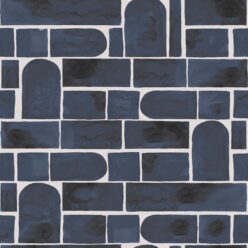
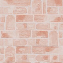
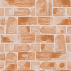
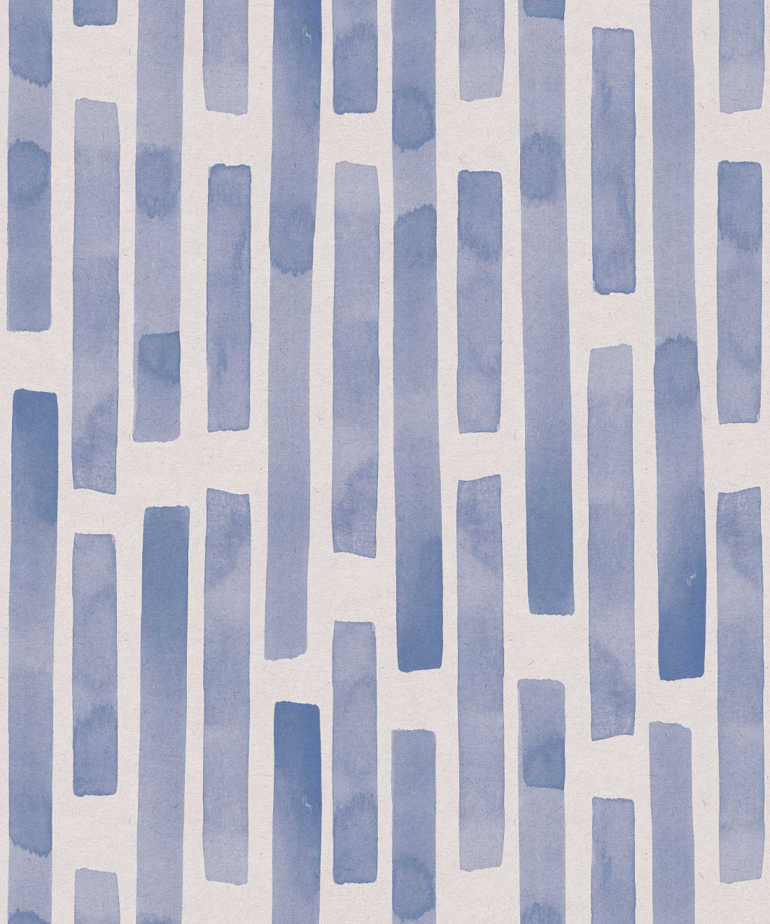
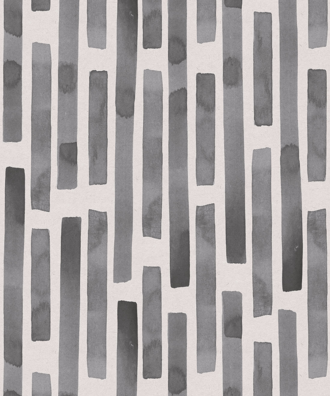
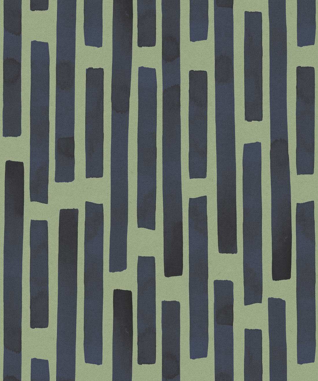
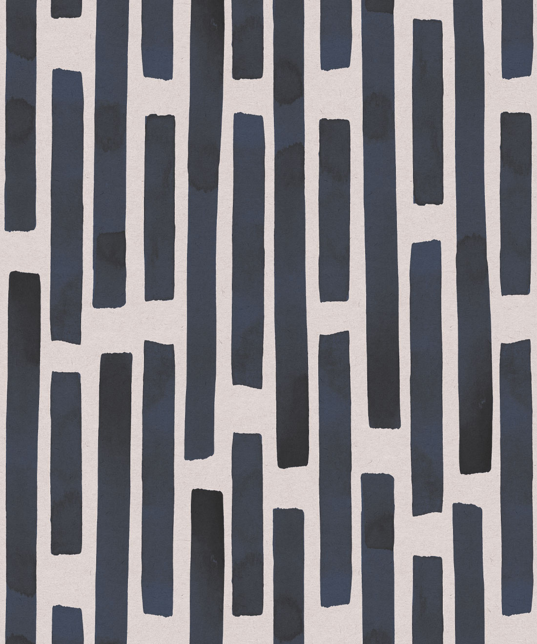
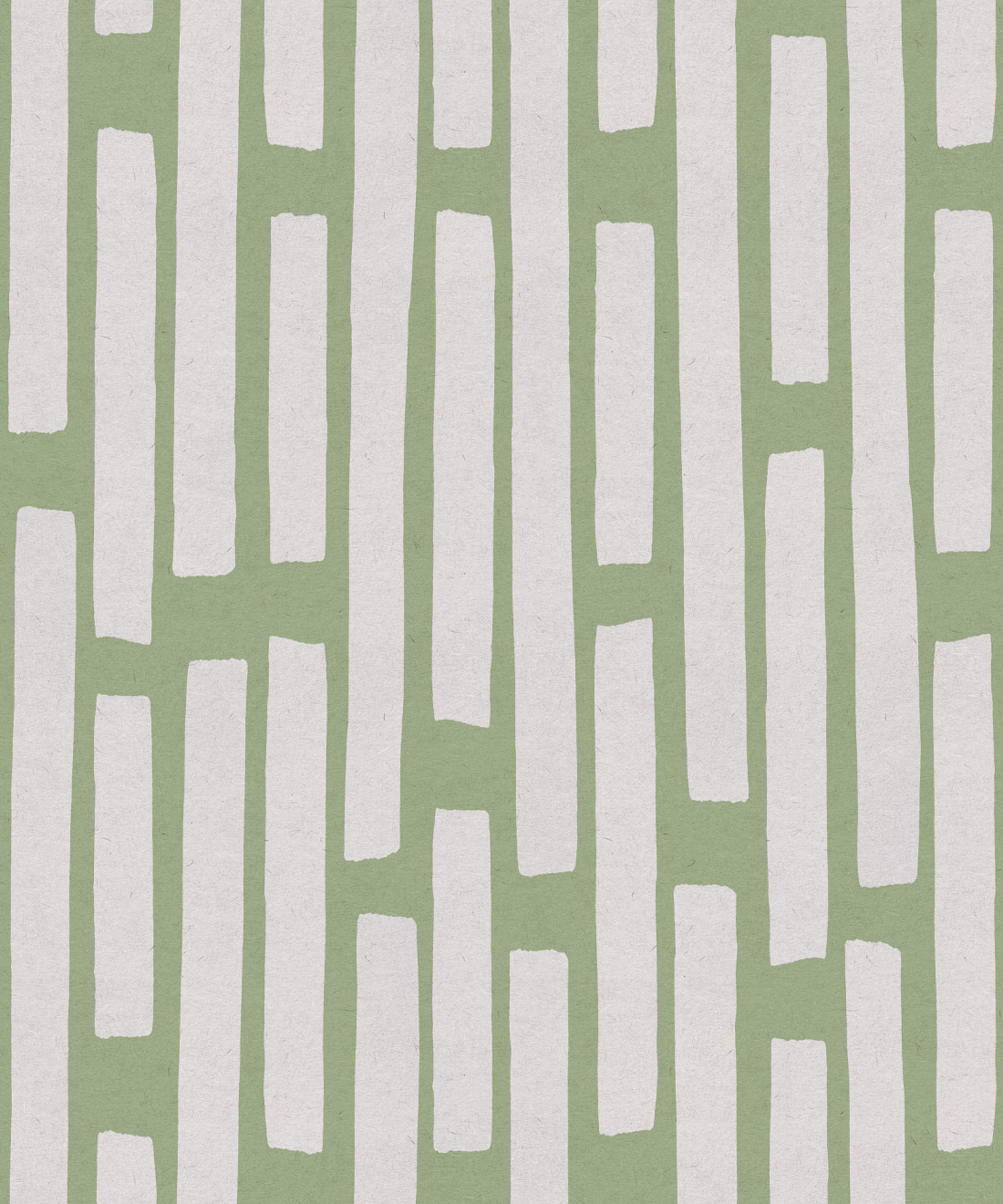
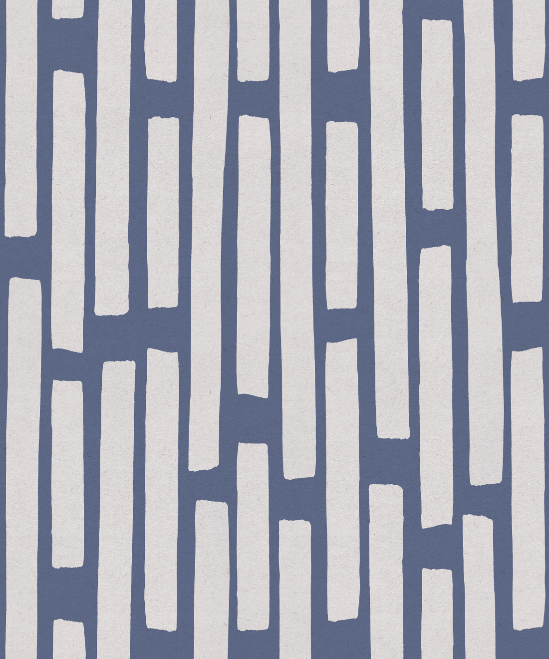
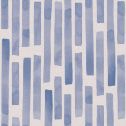
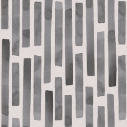
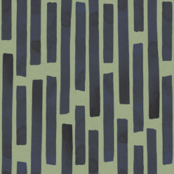
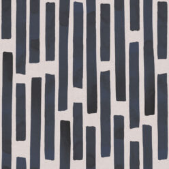
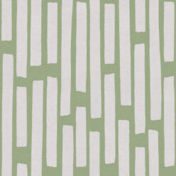
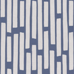
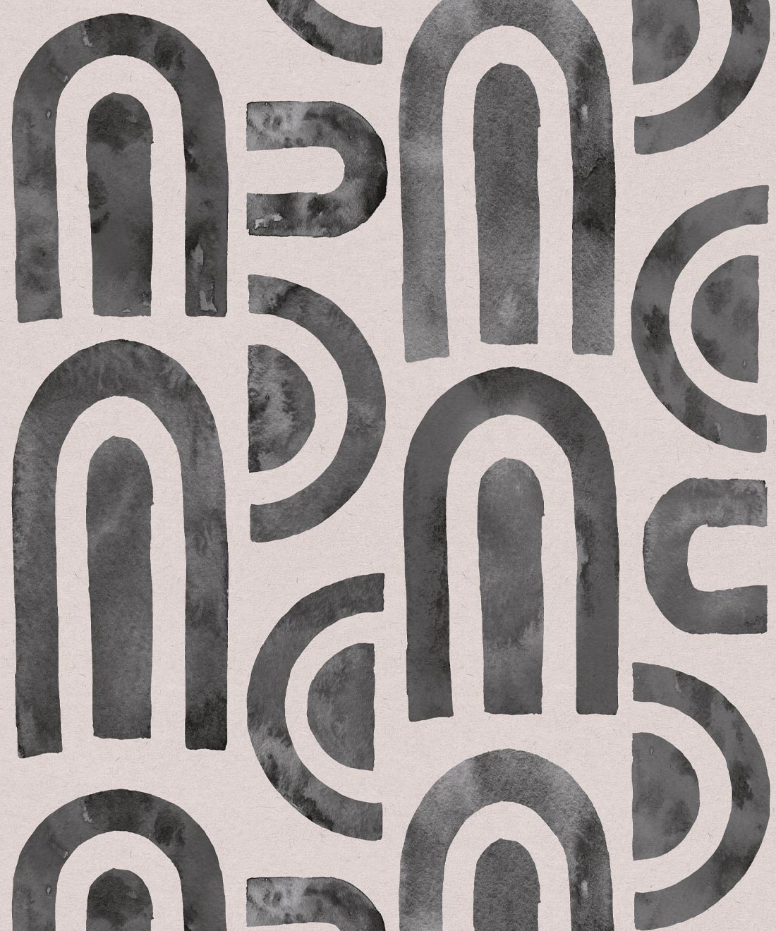
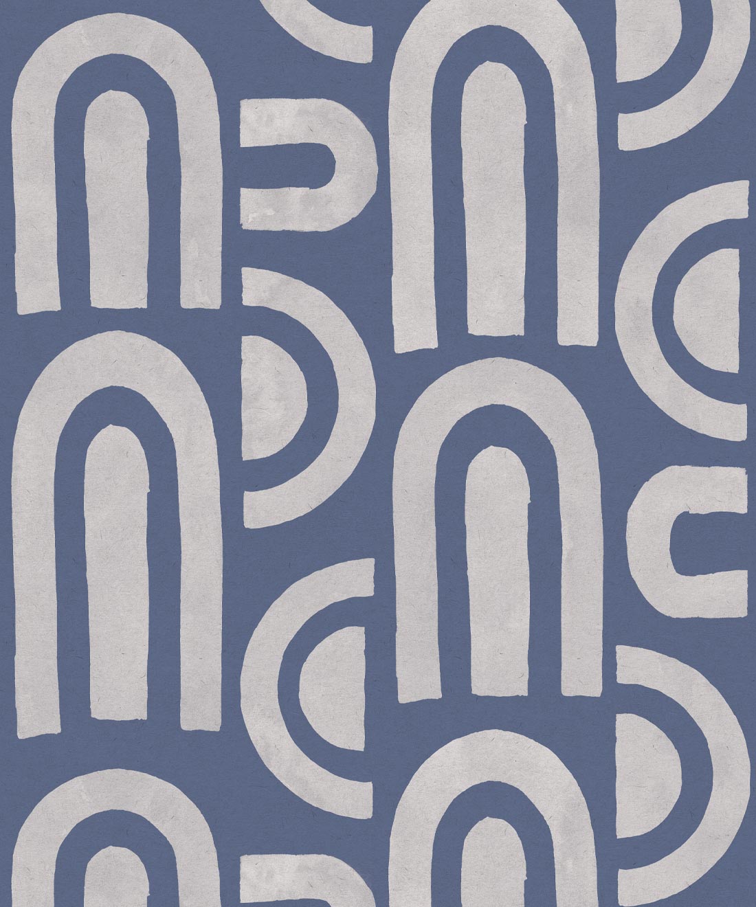
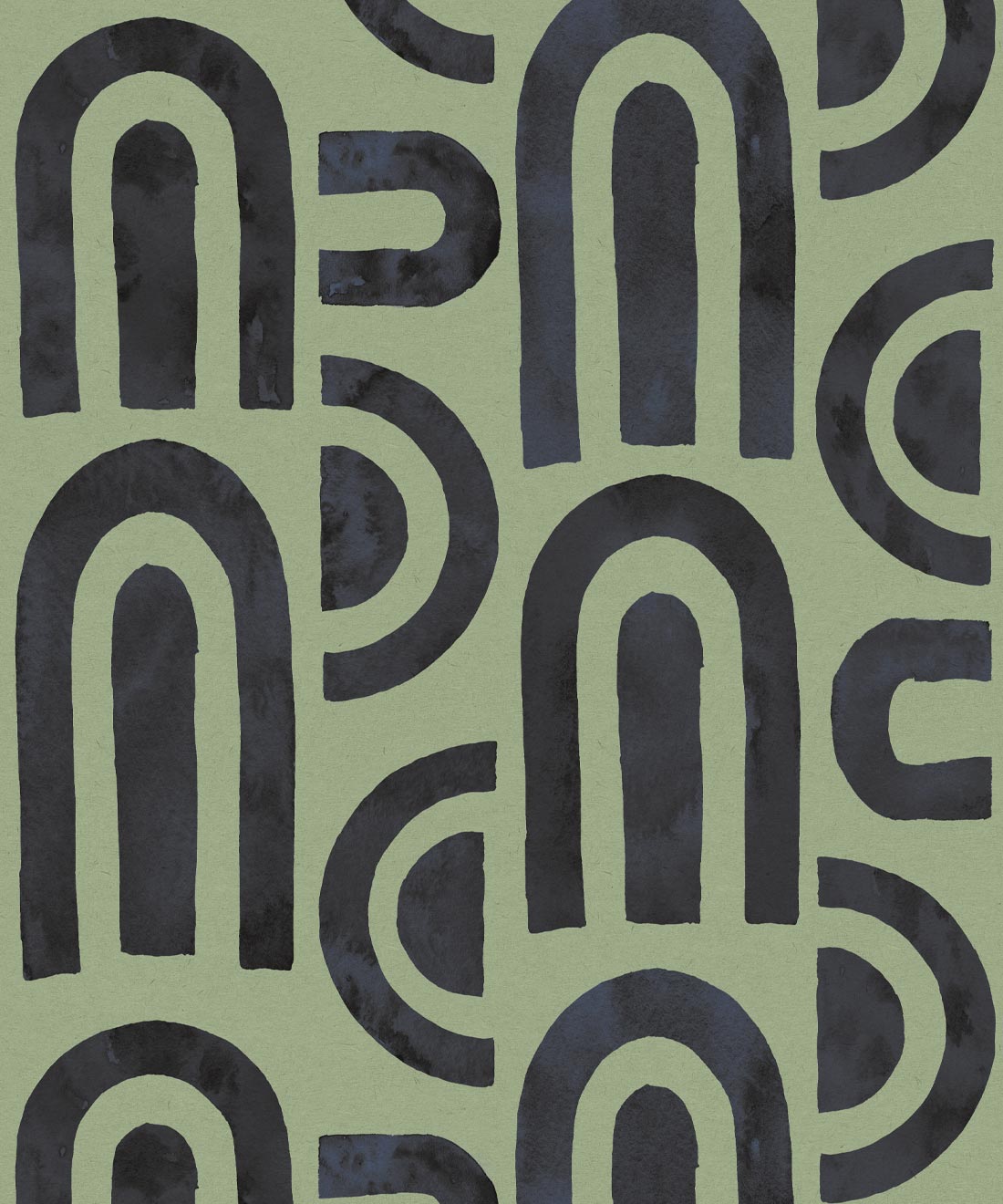
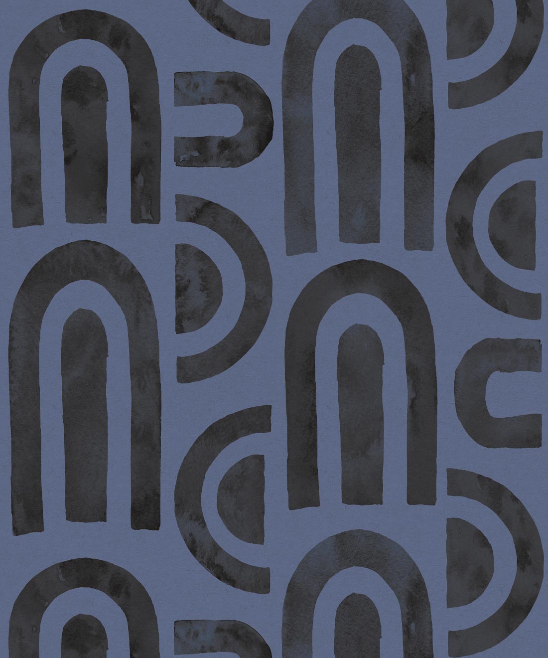
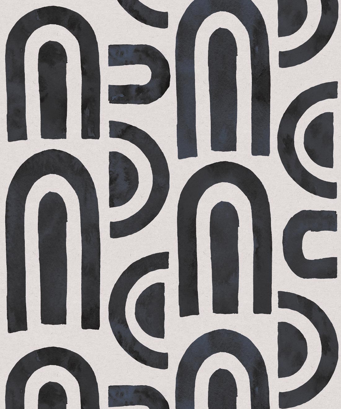
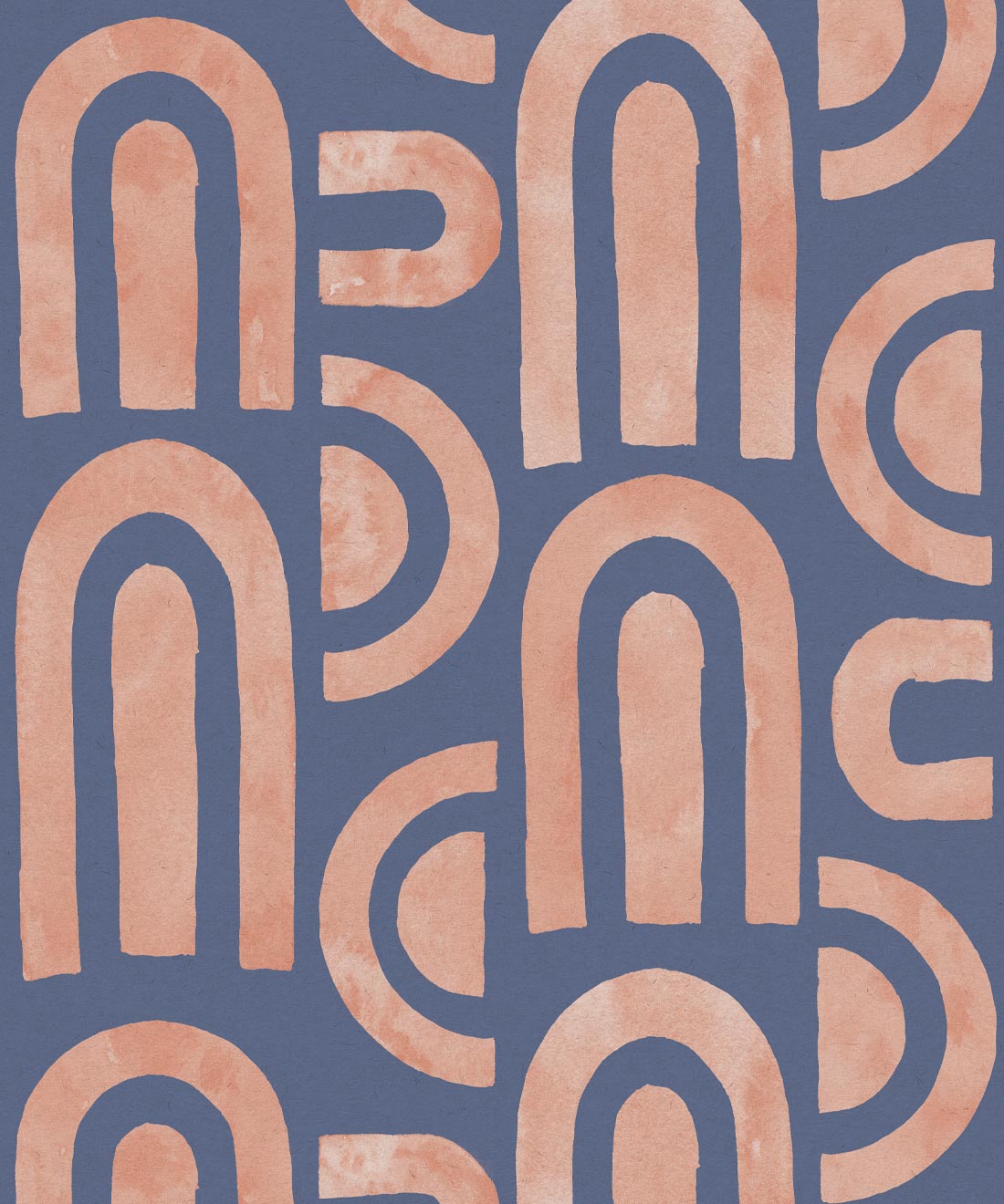
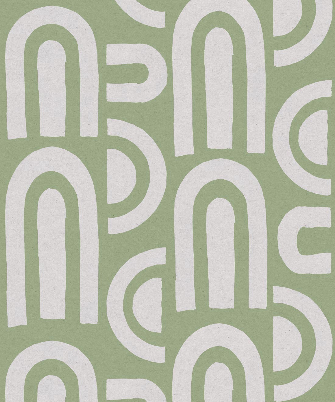
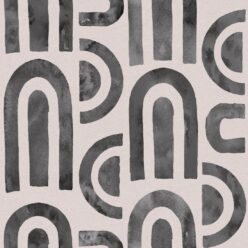
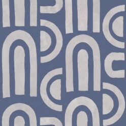
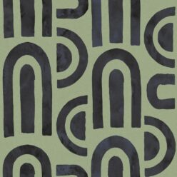
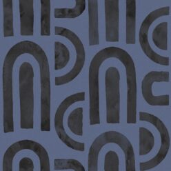
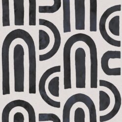
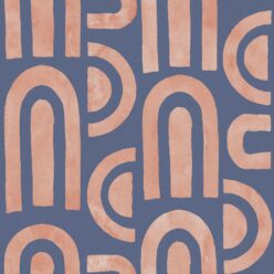
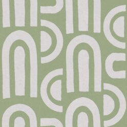
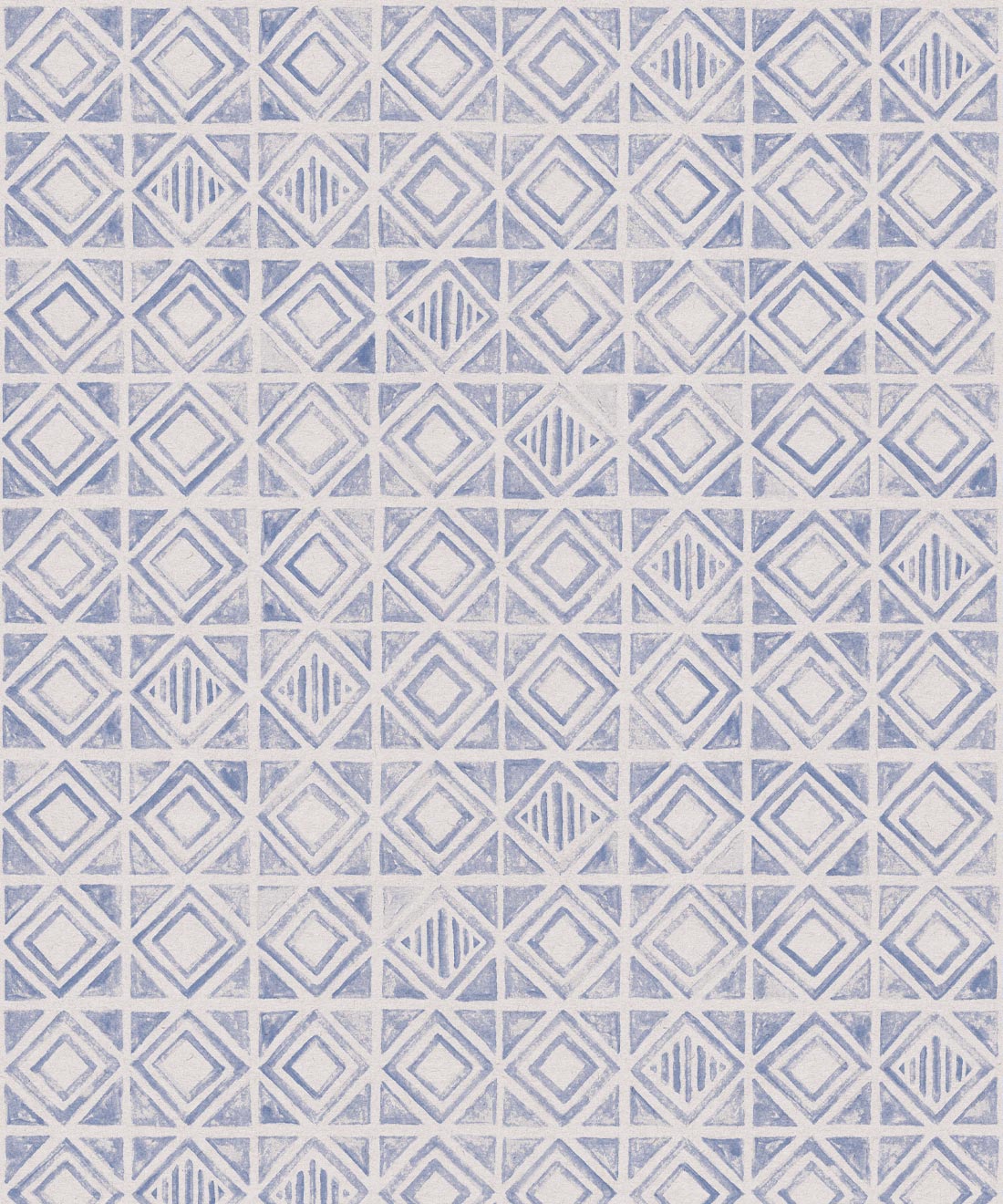
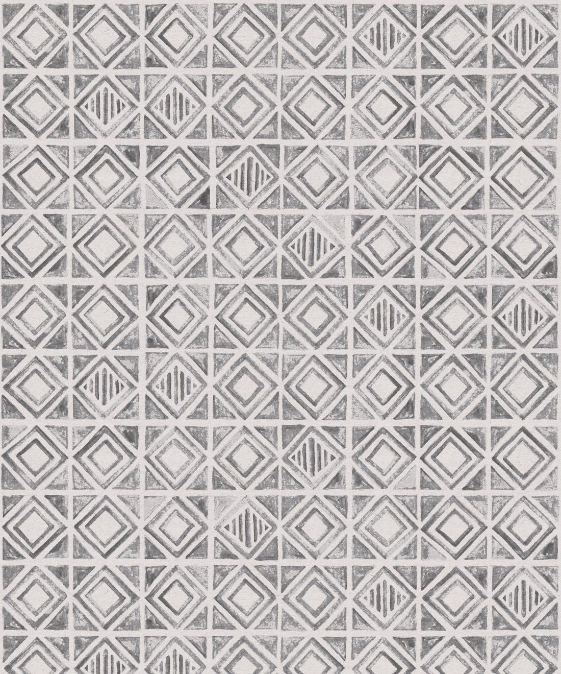
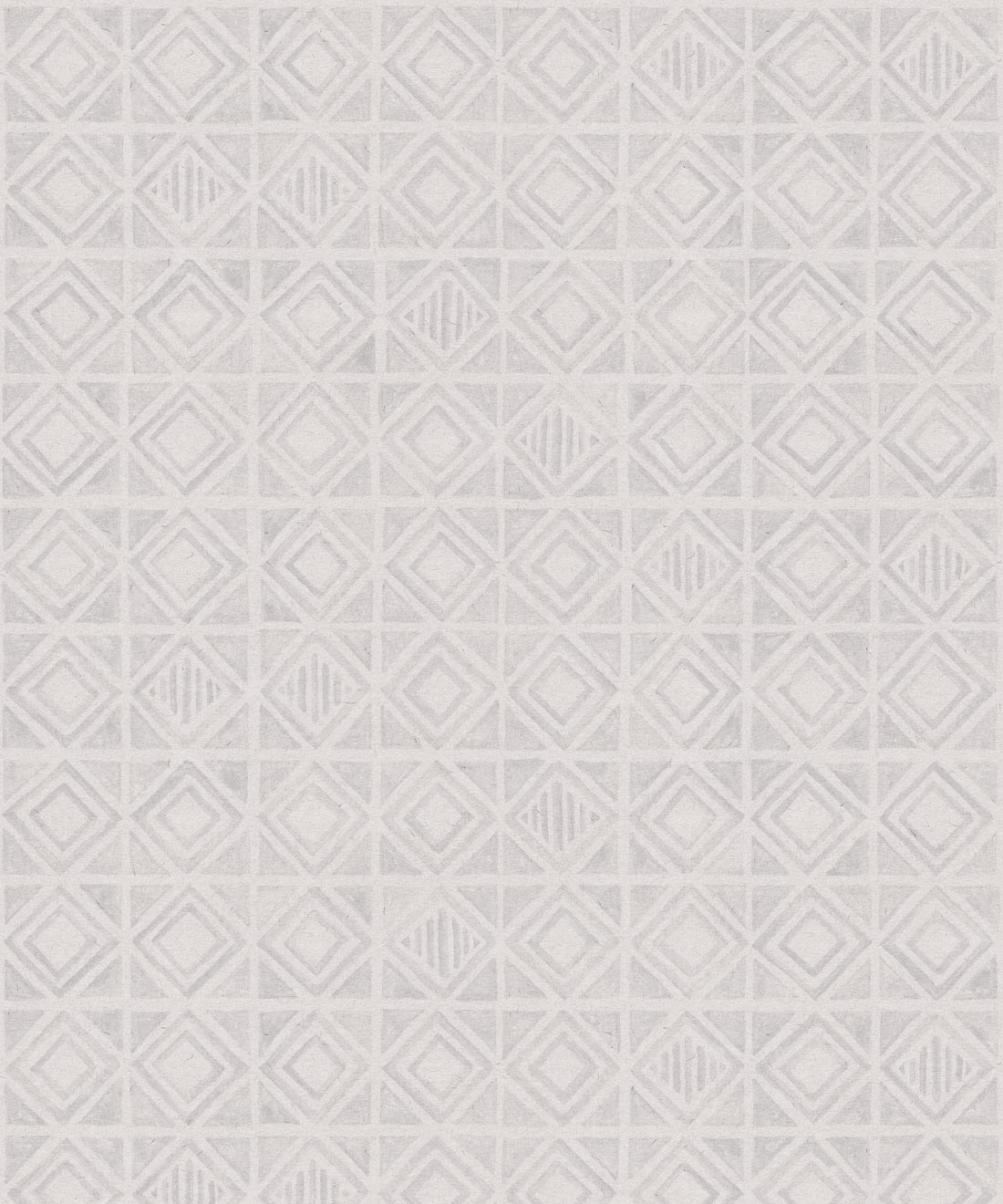
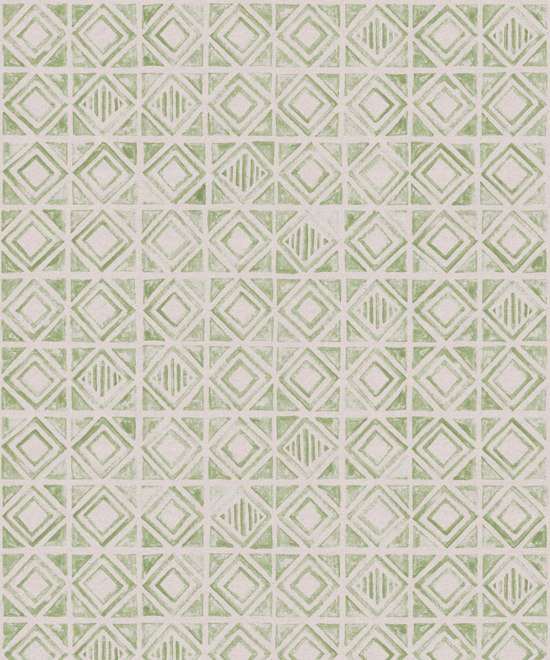
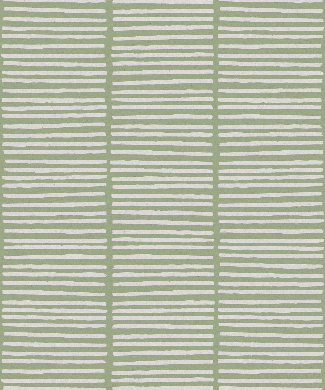
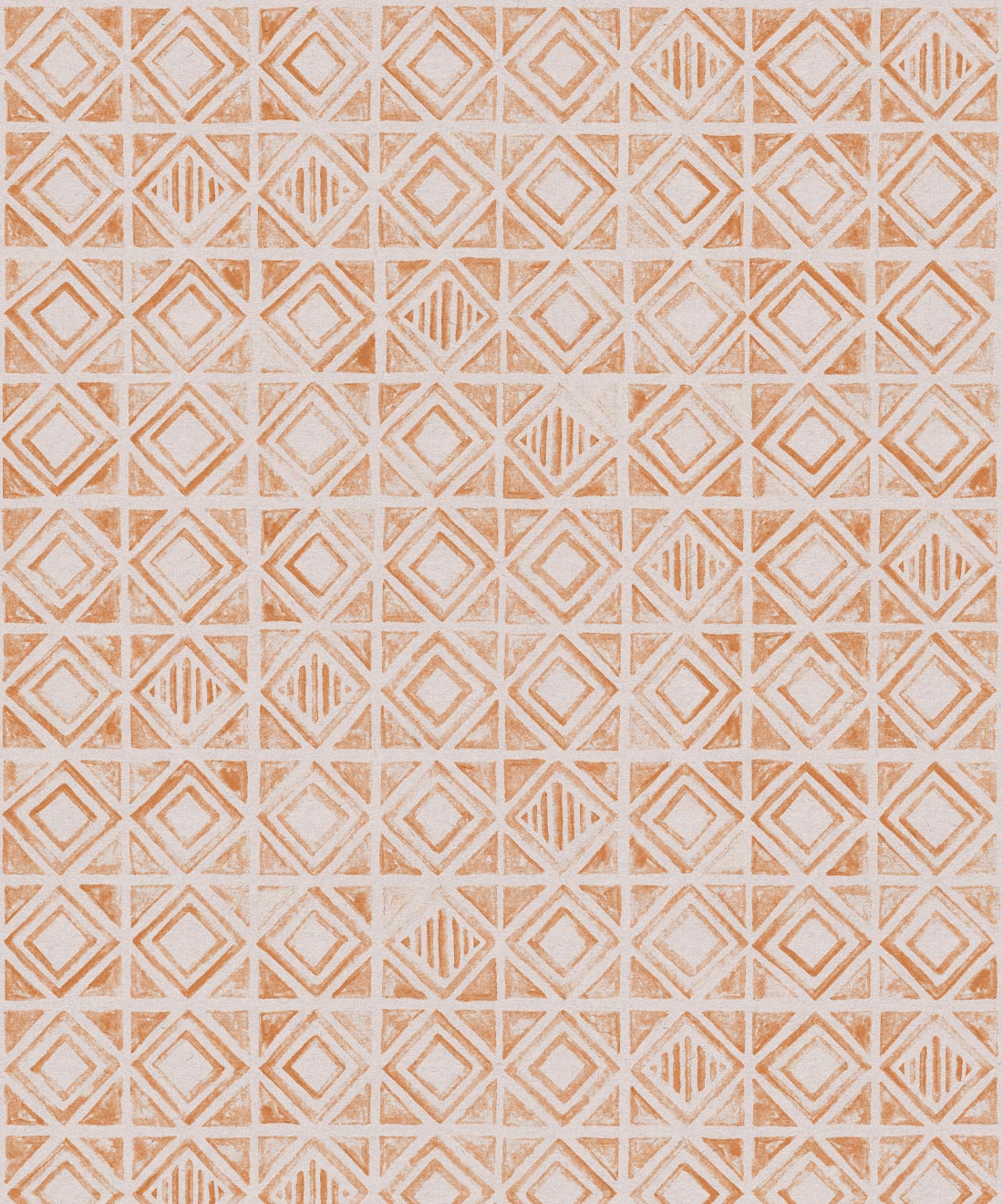
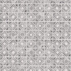
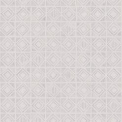
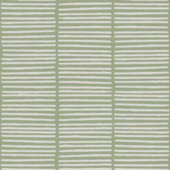
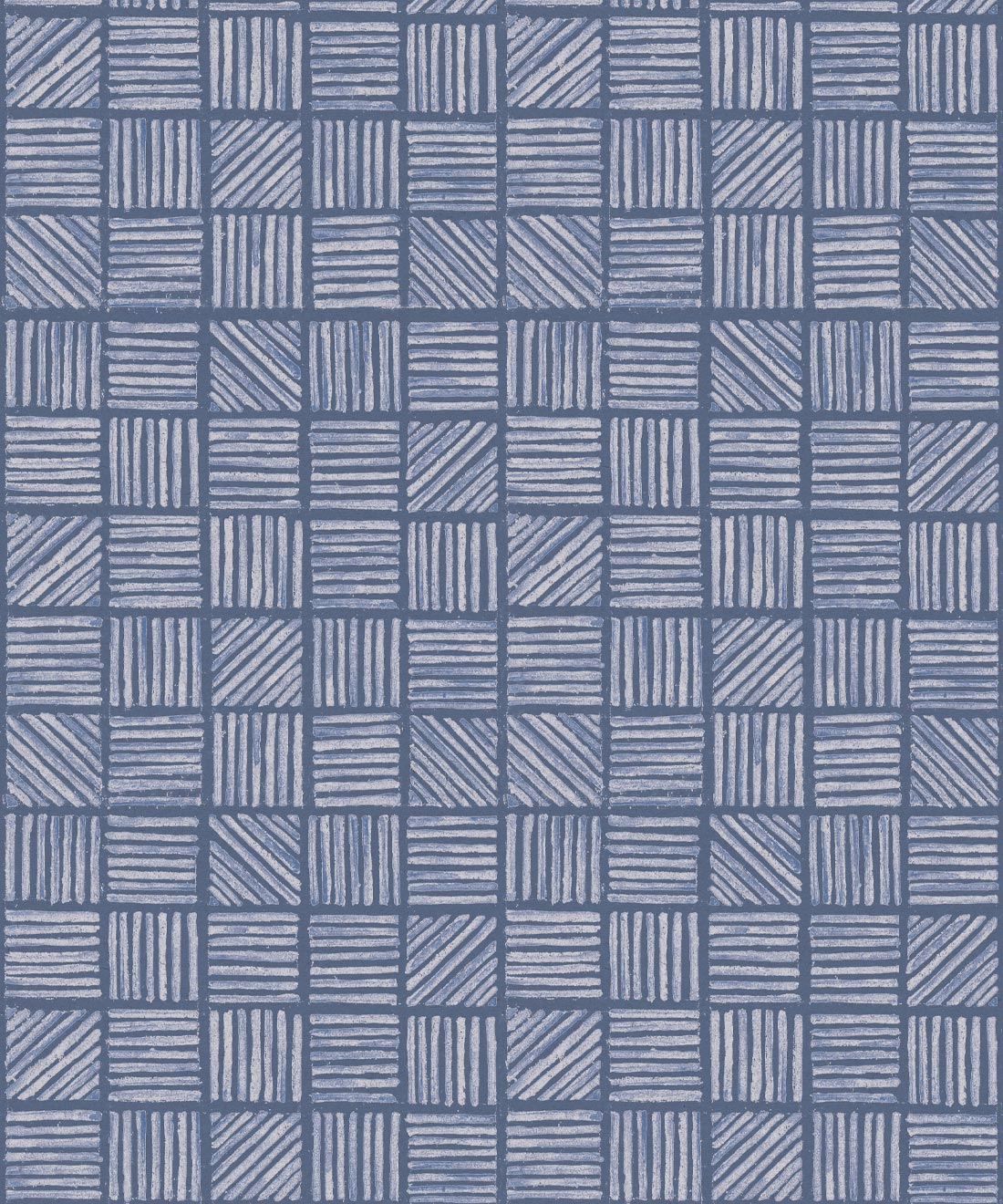
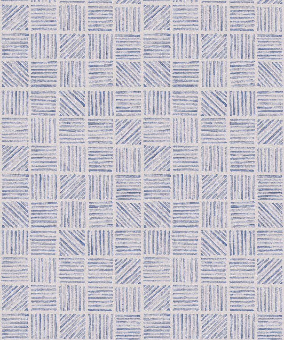
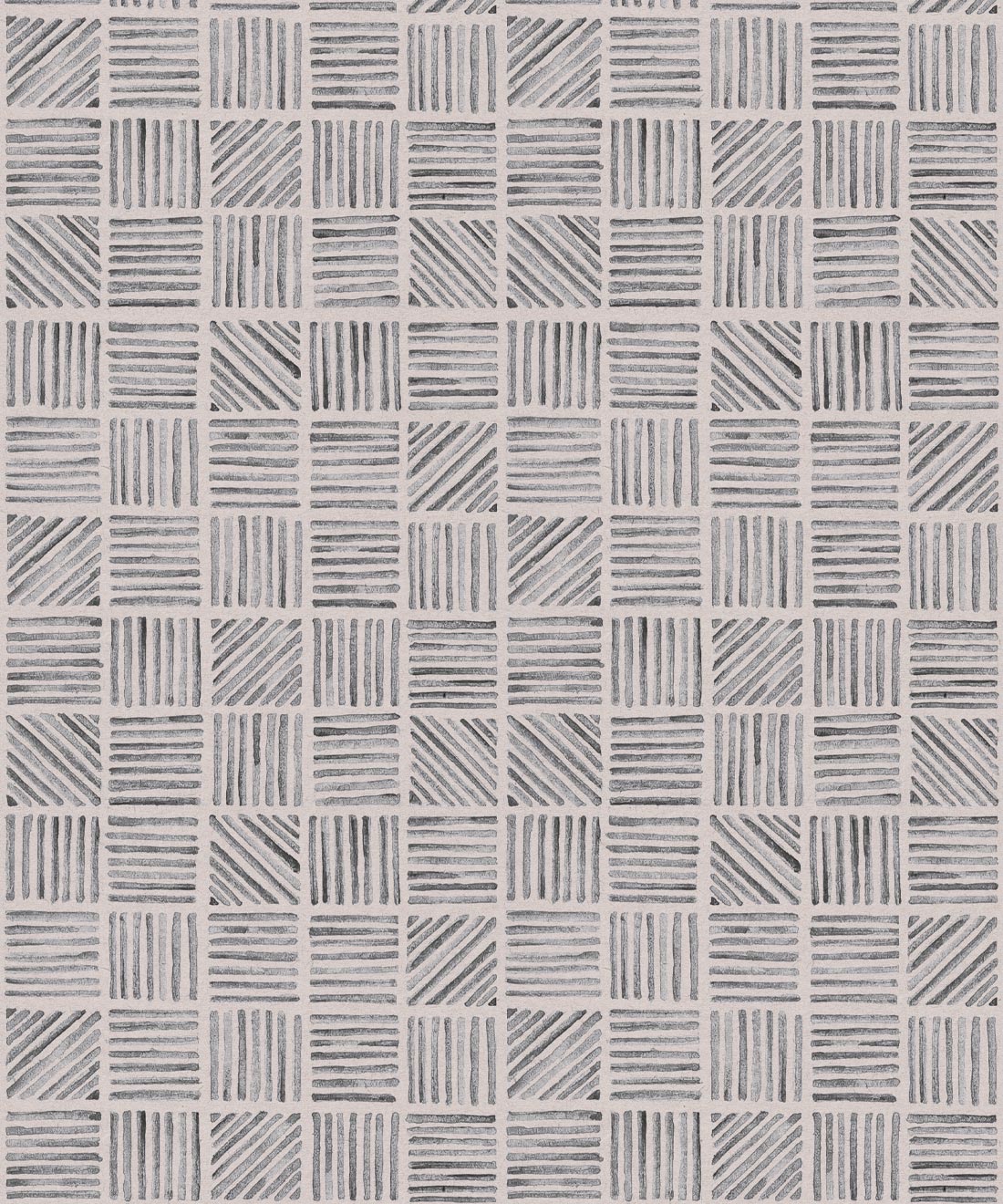
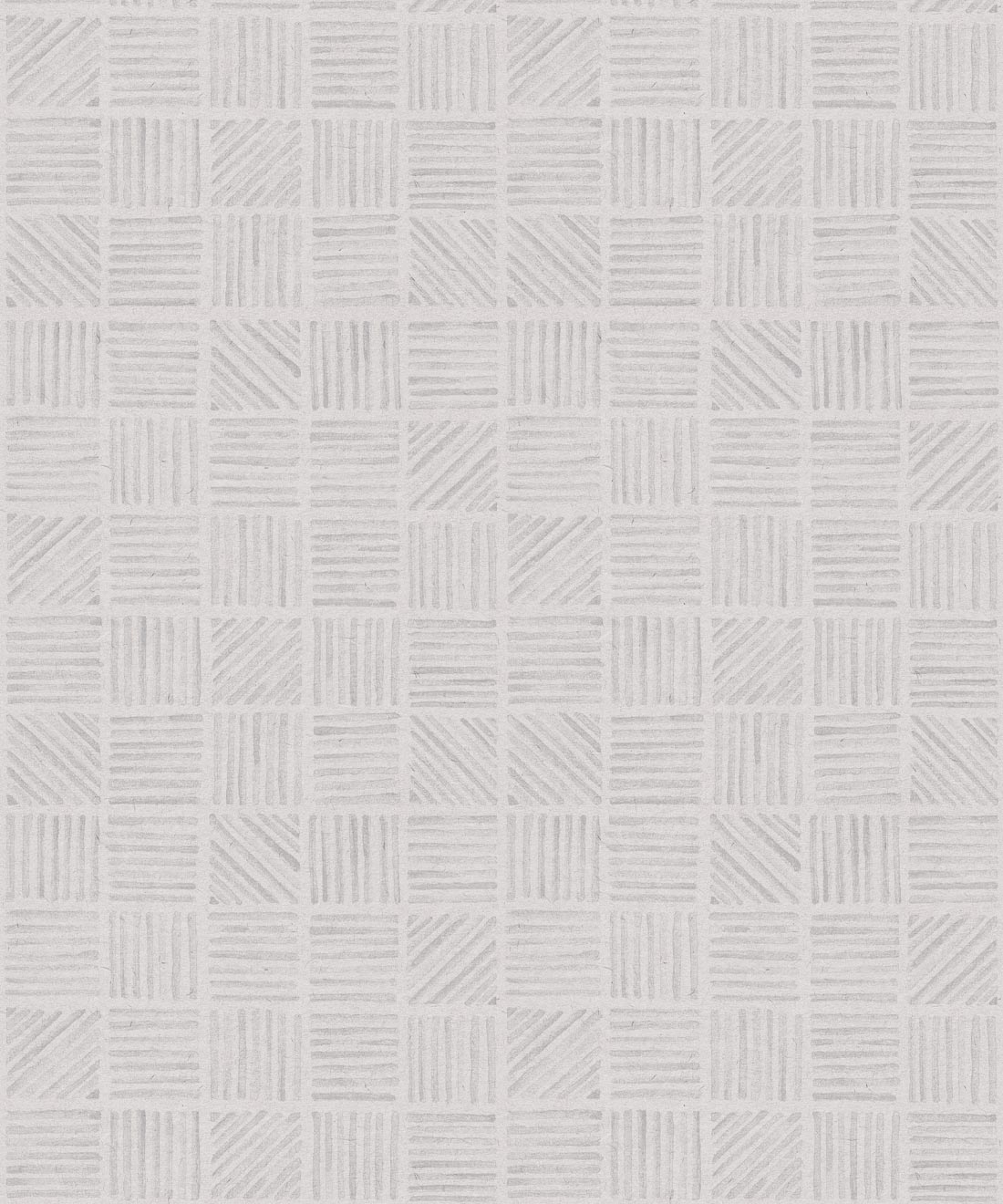
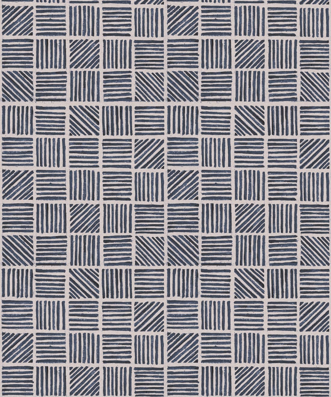
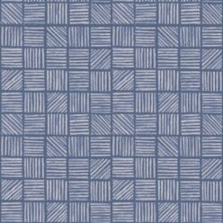
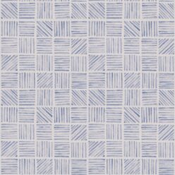
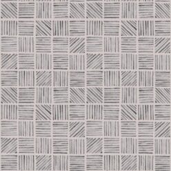
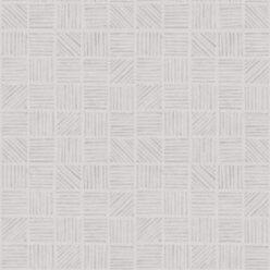
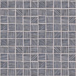
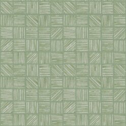
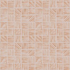
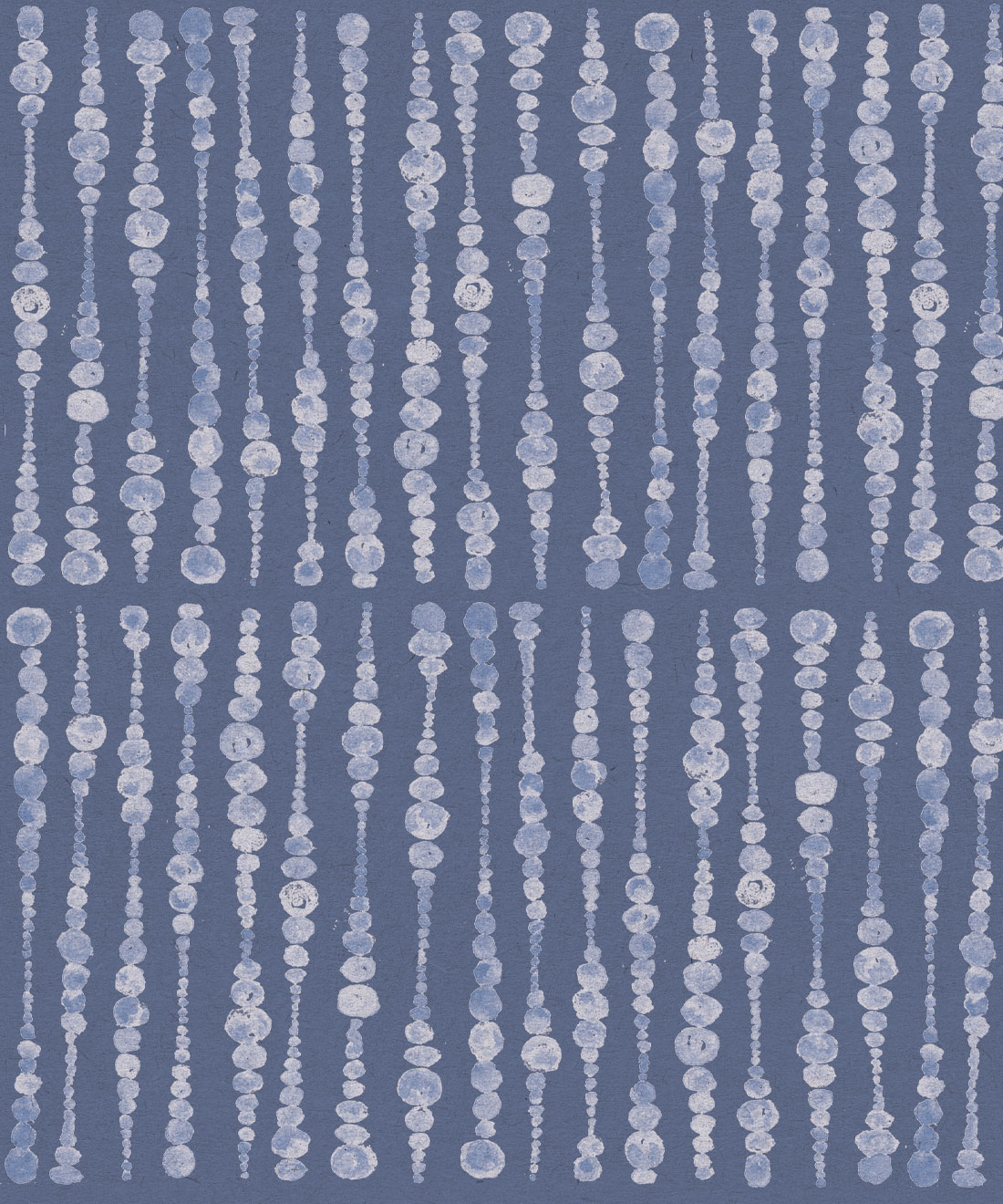
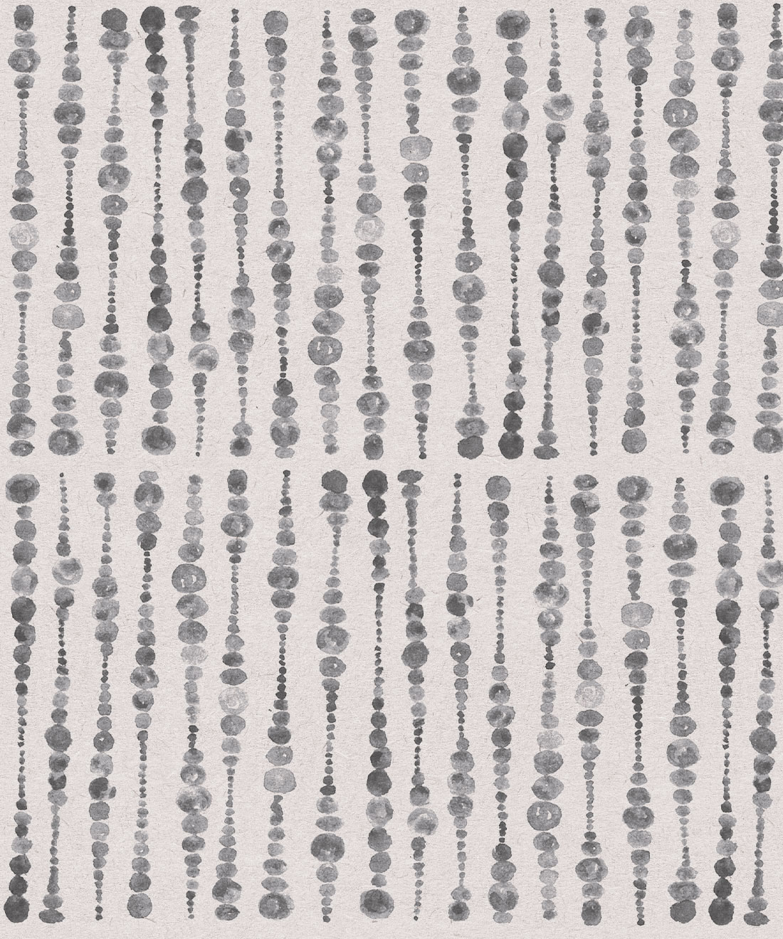
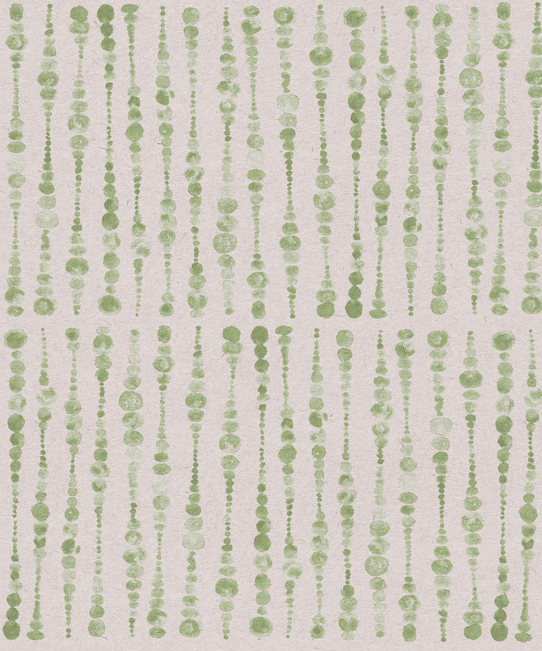
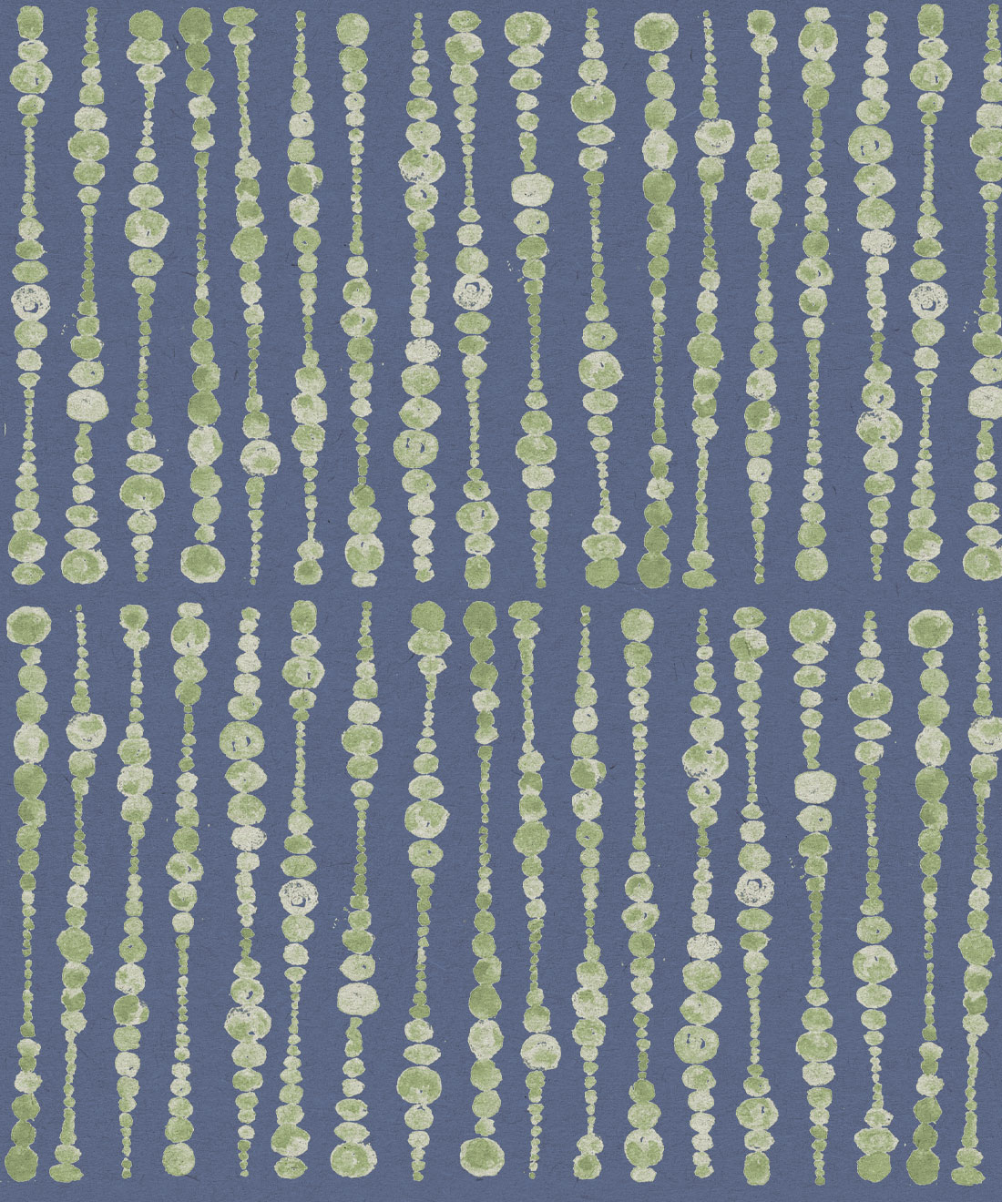
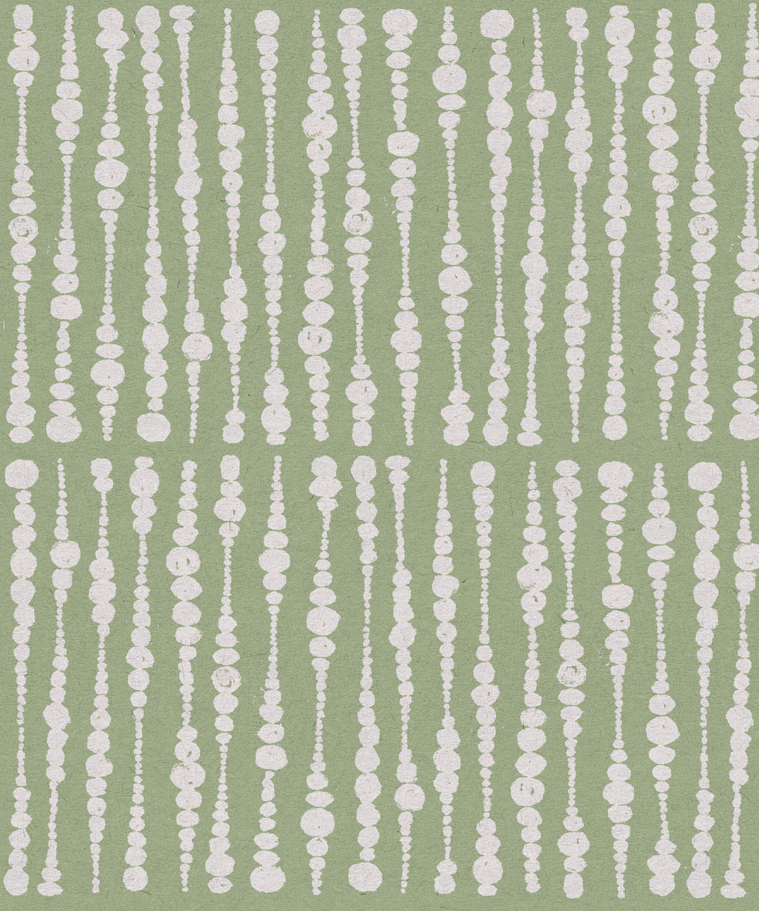
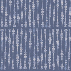
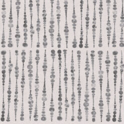
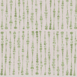
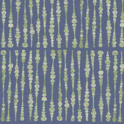
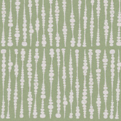
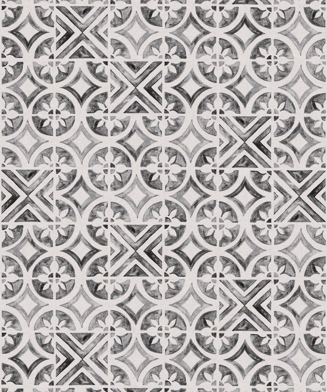
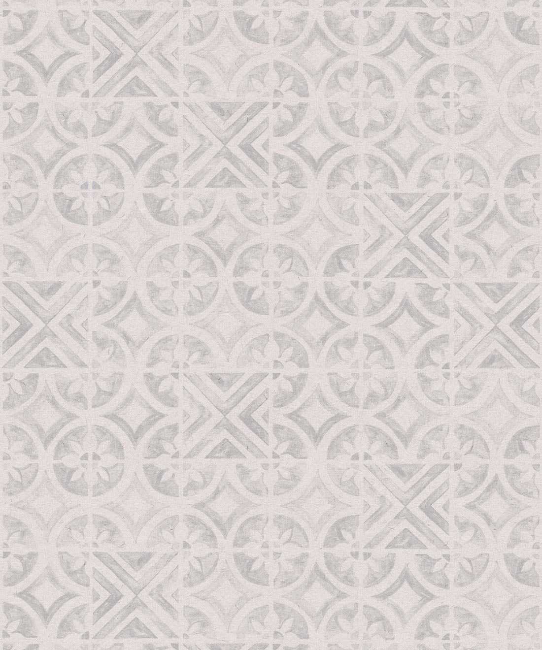
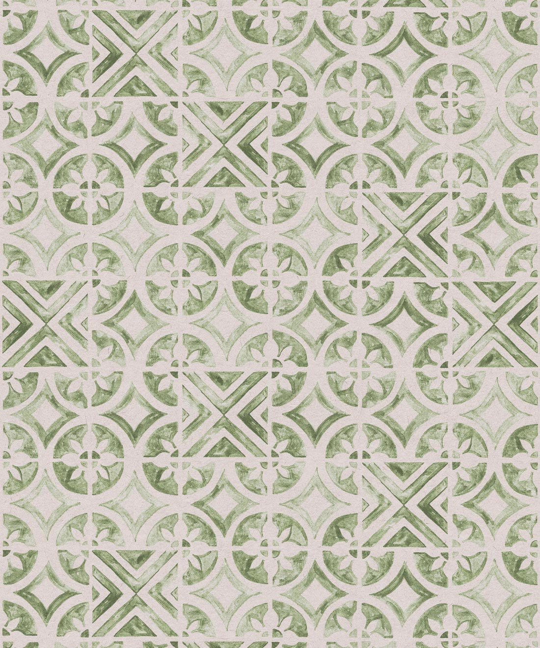
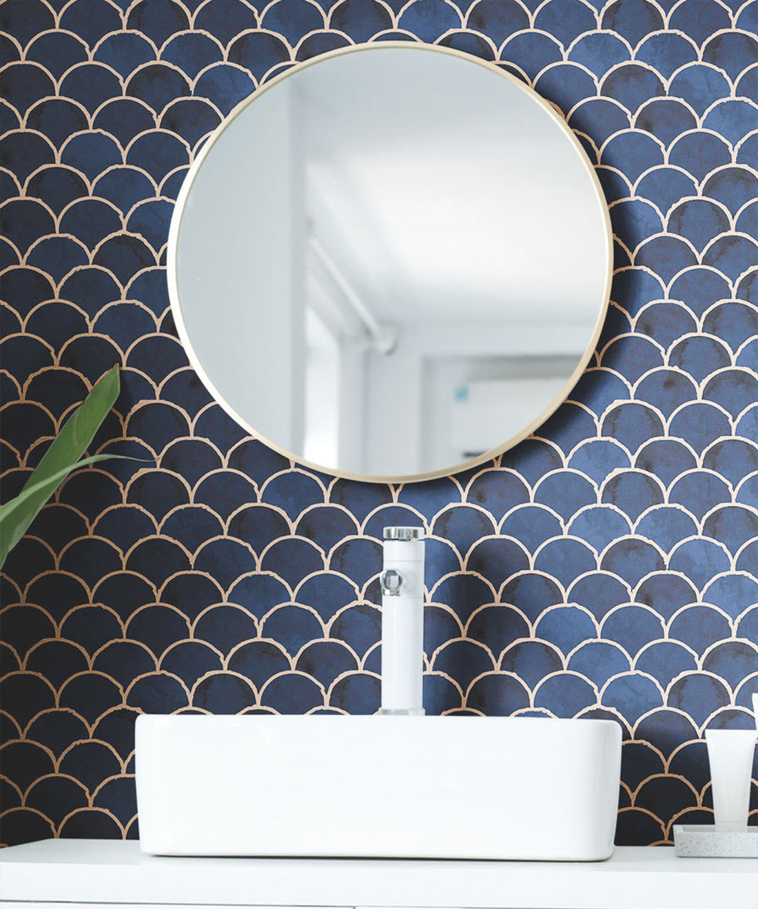
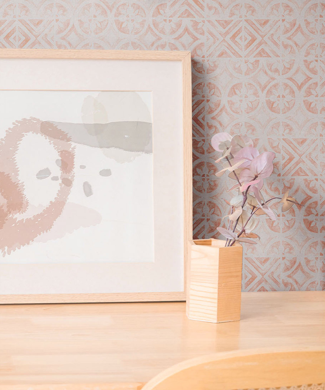
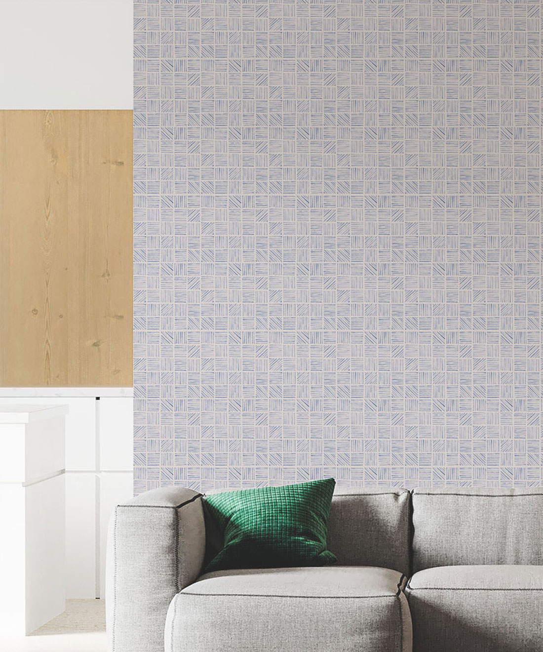
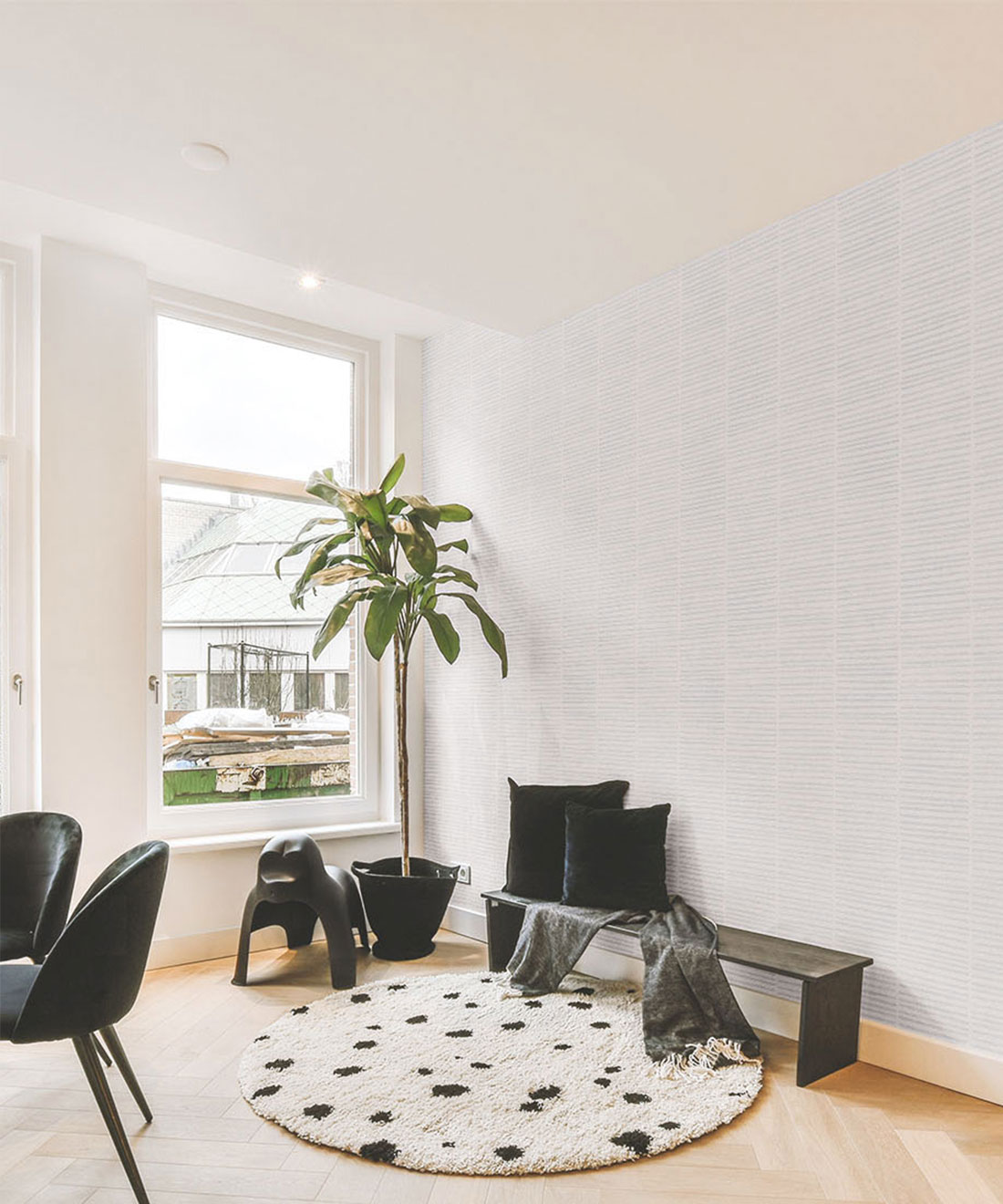
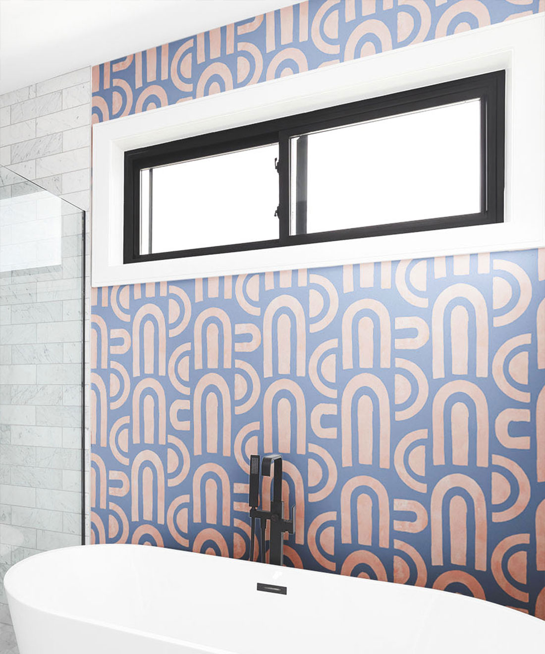
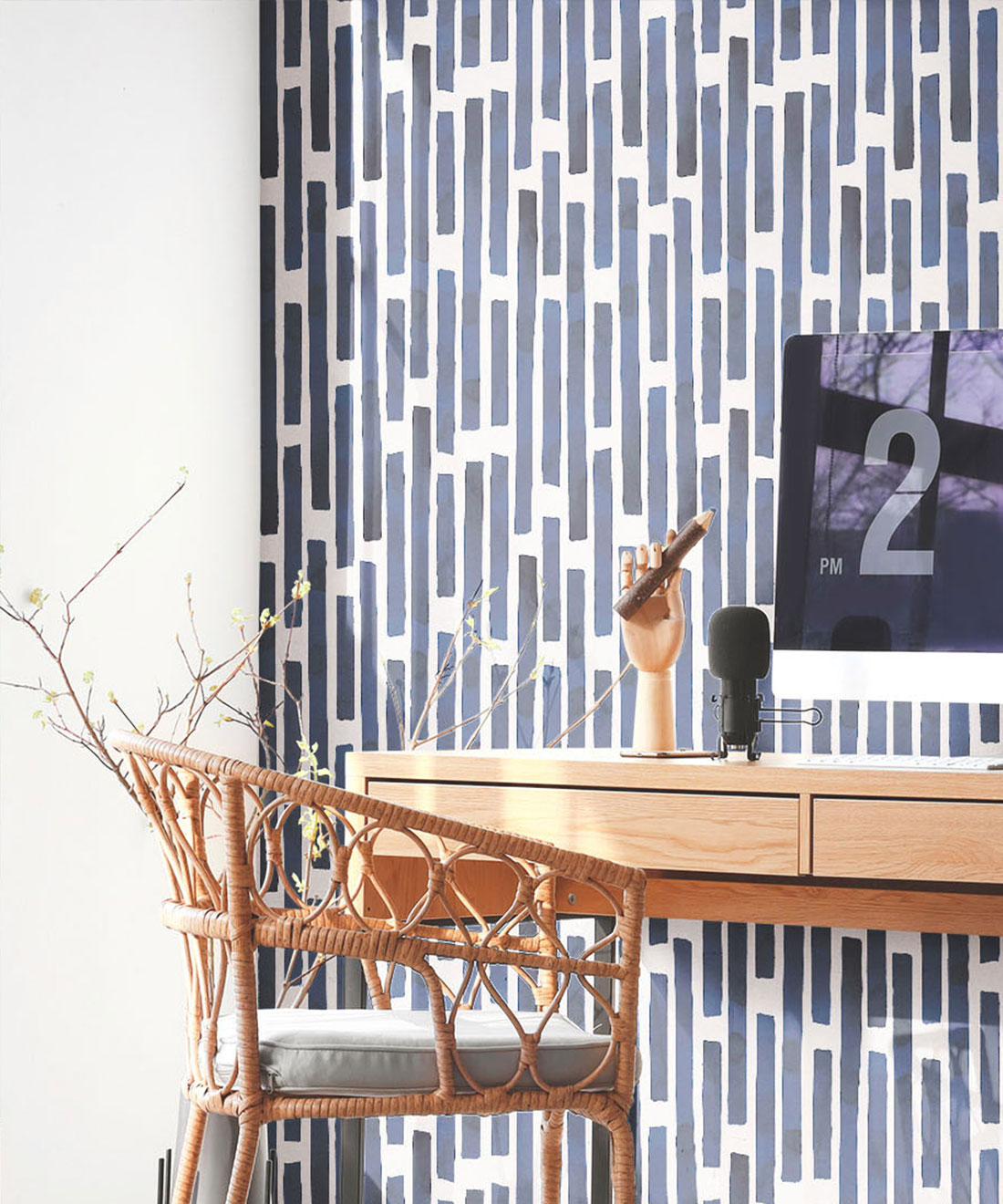
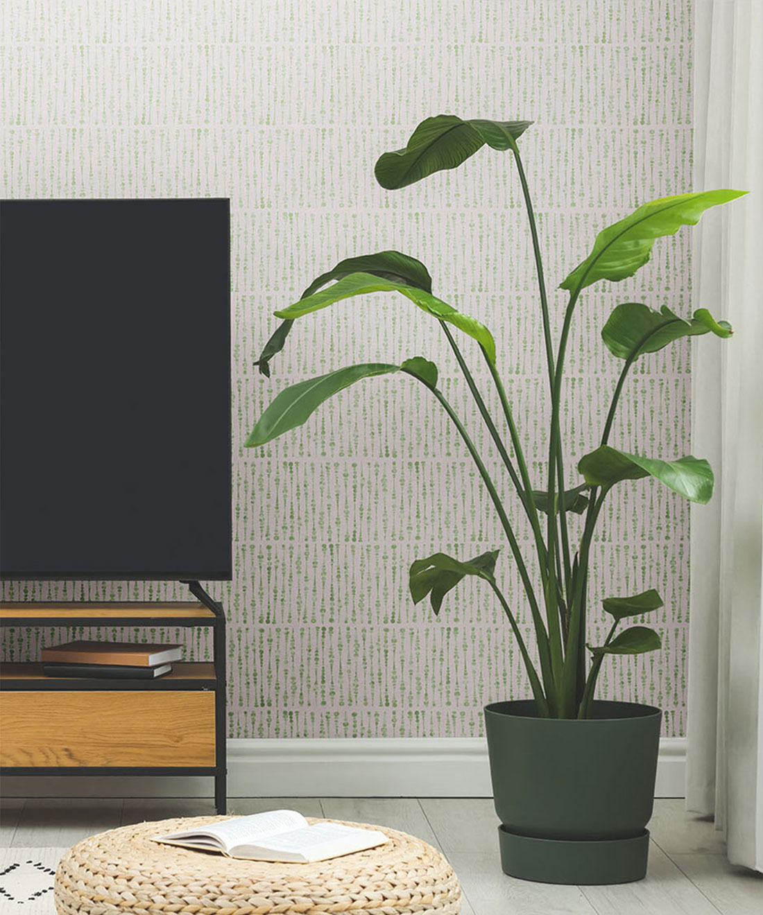
Honestly, I’m entirely humbled whenever I see any of my designs in reality. As the design industry moves further into the digital world, it’s often difficult for designers to experience their work in a tangible format. I love the boldness of ‘Colonnes’ in Midnight on Light Beige and the contrast of ‘Formes Deux’ in Grey on Navy. Most of all, I enjoy the subtlety of Grey against White in linear designs like ‘Lignes’ and ‘Lignes Deux’ – I can see these being perfect for corporate environments and cafes (perhaps because these are both locations in which I’ve spent considerable time!) Partnering with a wallpaper giant like Milton & King is an incredible honor, and we’ve made some predictions already. I know some designs will be used in completely different spaces than we expected, and I’m very excited to see how people make those decisions.