

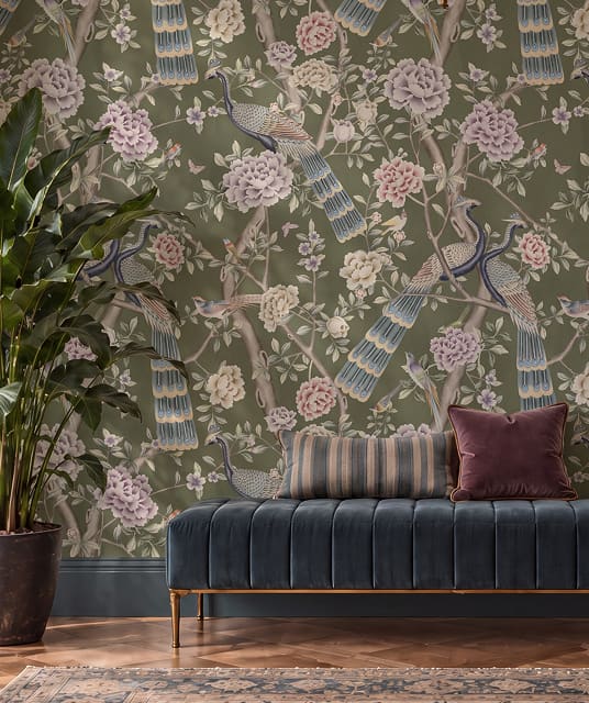
Webster Green from Benjamin Moore
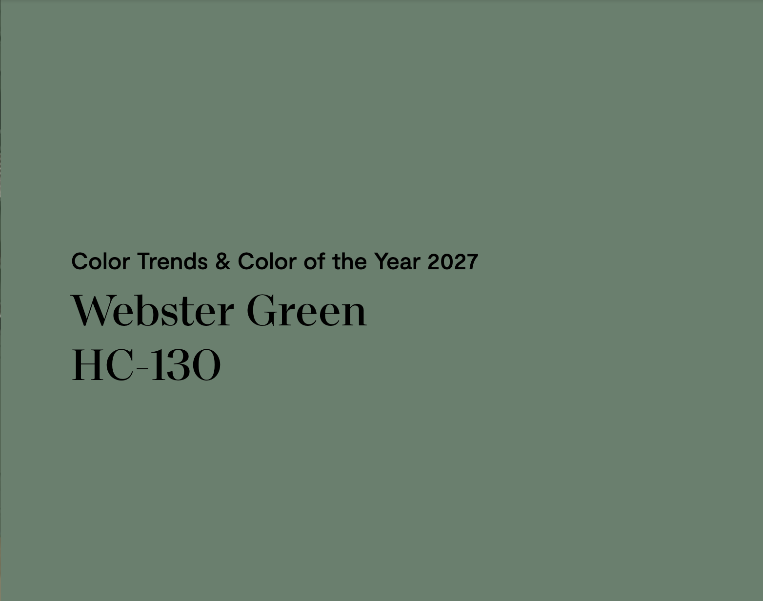
Benjamin Moore announced their Color of The Year 2027 as Webster Green.
They state, “We wanted to pick a green that felt fresh and right for today, not a shade that reminisces. Knowing that stability, composure, and an interest in colors with a timeless essence are working their way into the home, Webster Green HC-130 stood out from the rest.” (Benjamin Moore)
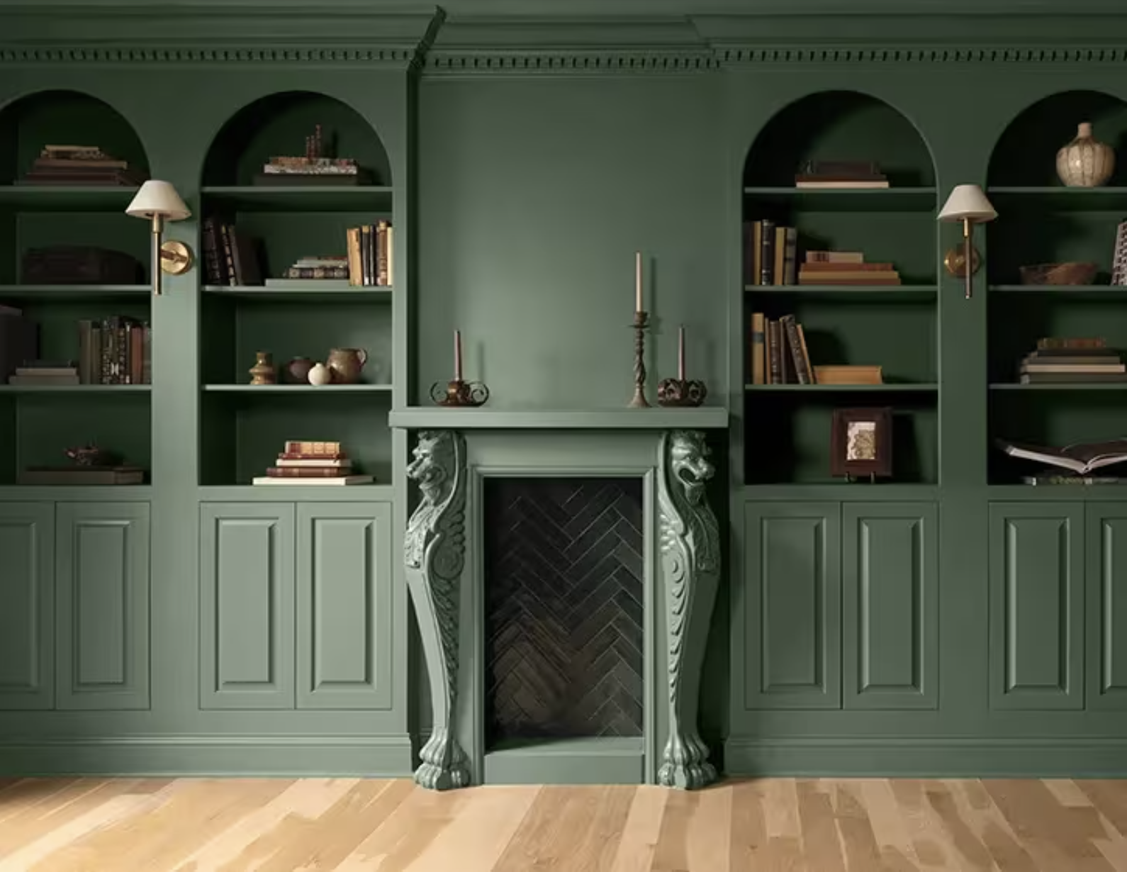
The color offers a soft elegance to the space and is suited for both interior and exterior features. It is both a classic and confident shade of green.
Vice President of Brand, Color and Integrated Marketing at Benjamin Moore opines, “The green color family’s ability to adapt and transform makes it incredibly timeless…a midtone that serves as a reminder of the past but feels right and relevant today.” (Benjamin Moore)
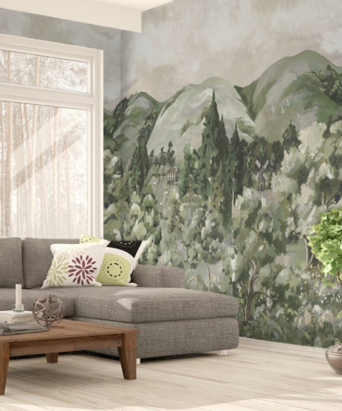
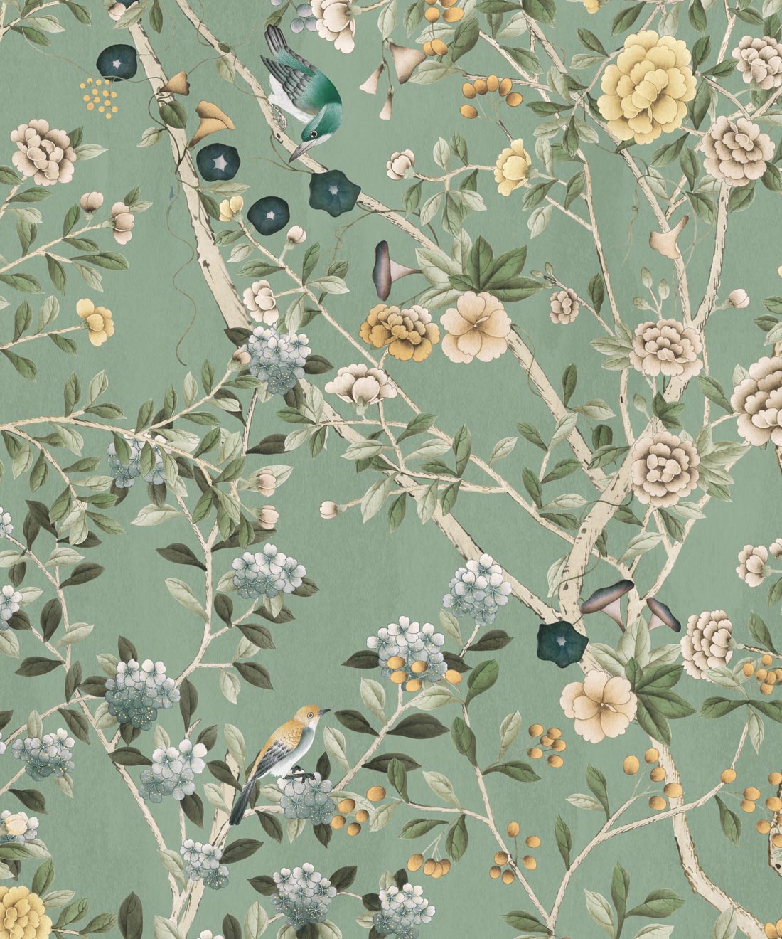
Let’s look at some wallpaper designs that might pair well with Benjamin Moore’s Color of the Year 2027.



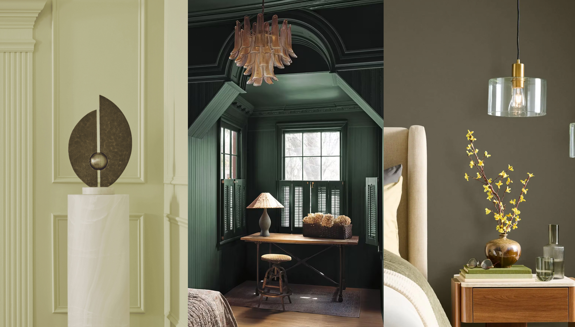
Celery by Sherwin-Williams
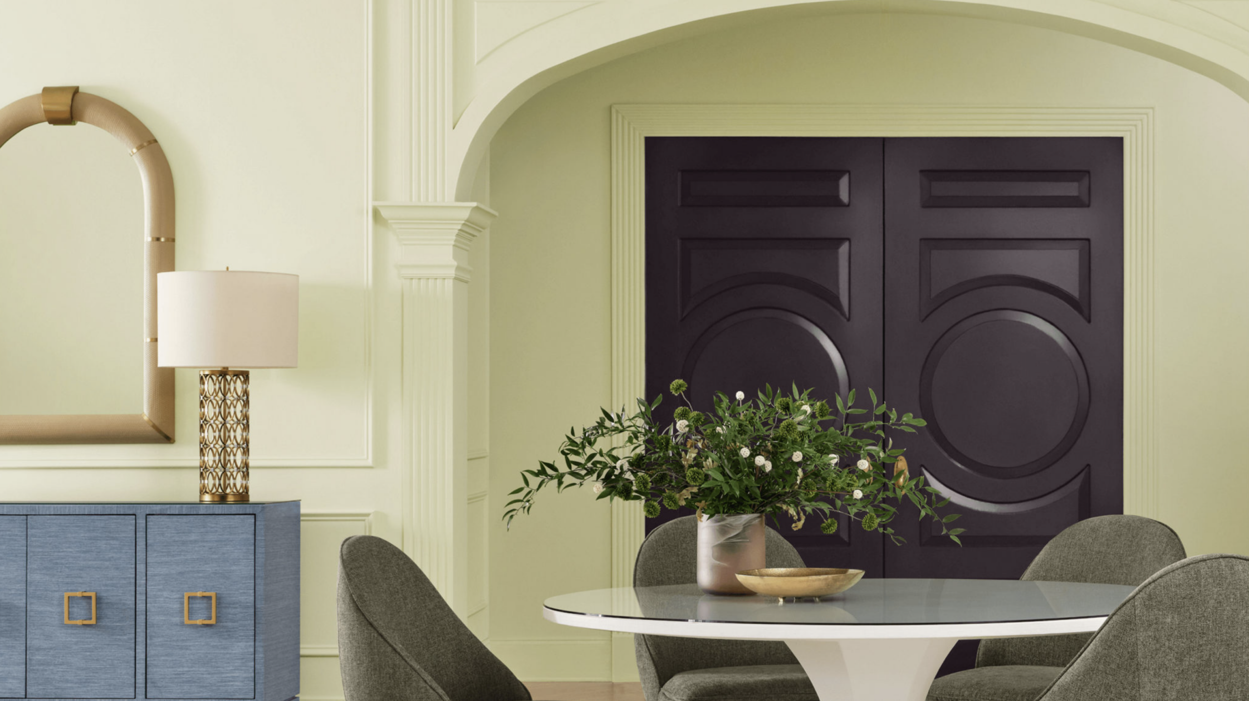
Sherwin-Williams took a brighter path for their Color of the Year 2027 with Celery.
They refer to the color as “crisp and calming…a luminous light green that promotes balance and elegance in every space” (Sherwin Williams) Descriptions of this hue describe it as an herbal green or muted green having subtle yellow undertones. However, in appearance it seems to come across as just the opposite. With the yellows taking the predominant position and the greens in the undertones.
The Color Marketing Manager, Ashley Banbury, remarks on this pastel tint as feeling “like a quiet reset for the home.” (Sherwin Williams)
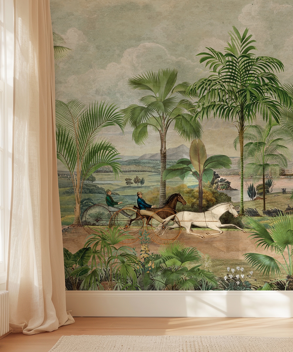
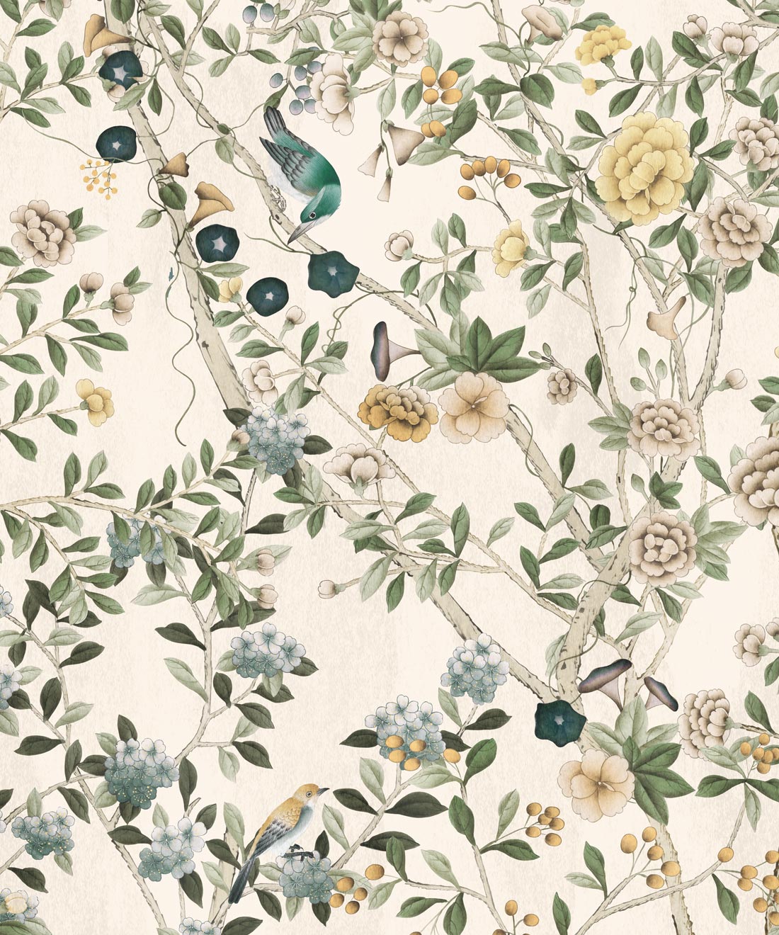
Let’s have a look at some matching and coordinating wallpaper options for Celery.


Grounded by Behr
We round out our Color of the Year 2027 feature with Behr’s Grounded.
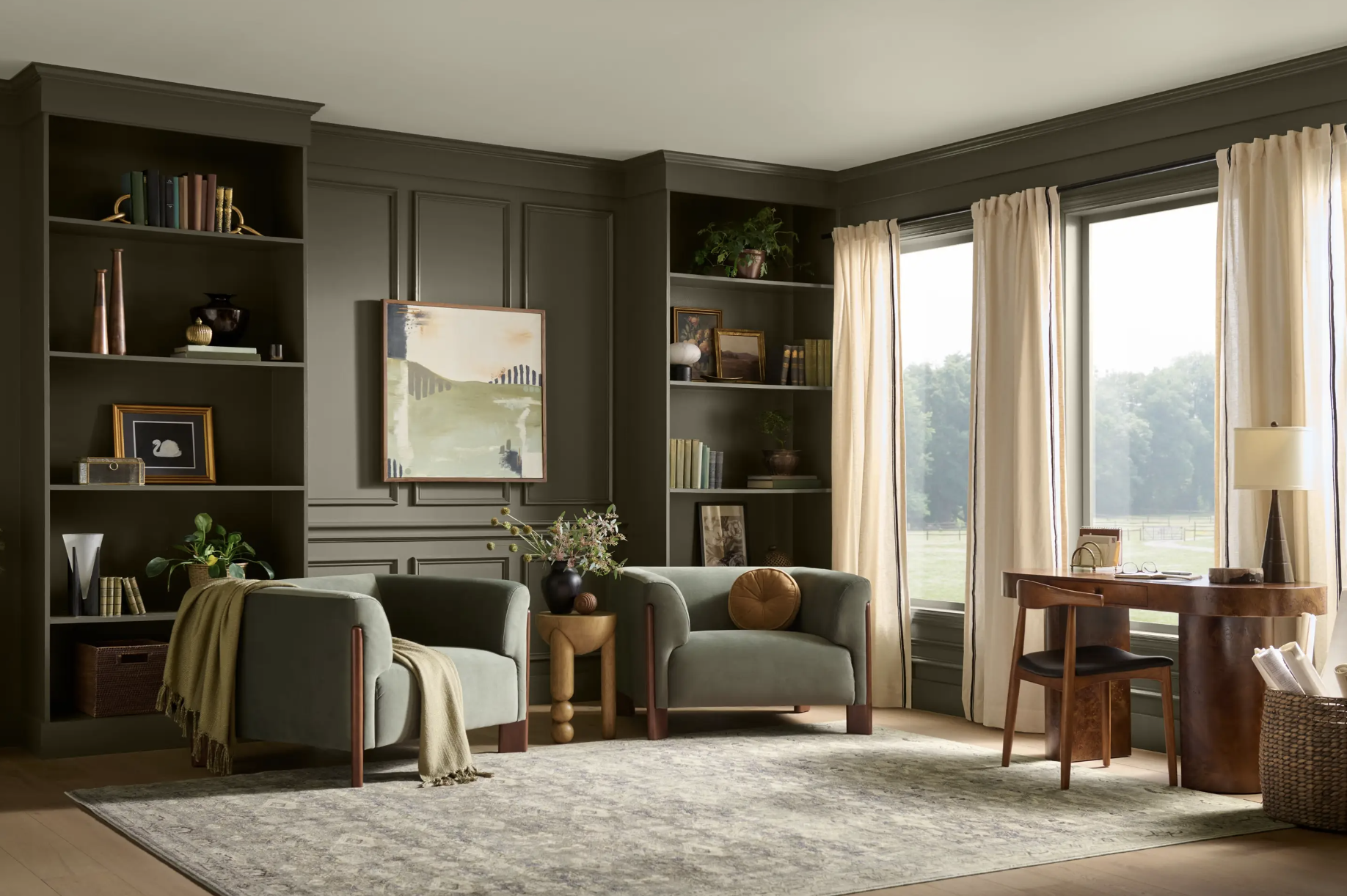
The company says this hue is “rooted in renewal”, a “mossy olive with earthy brown undertones.” (Behr)
Much like Sherwin-Williams, I see this description as flipped, with browns be the dominant color and the olive being the undertone. But one can easily see that this shade can sit comfortably in either seat. Described as a color that “invites a deeper exhale,” it is versatile, calming and definitely holds the room…well…grounded.
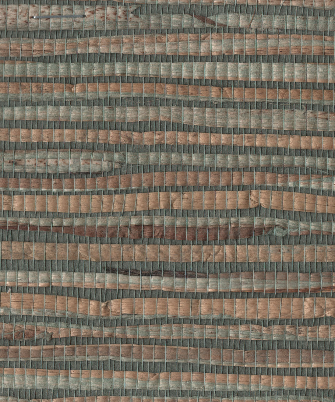
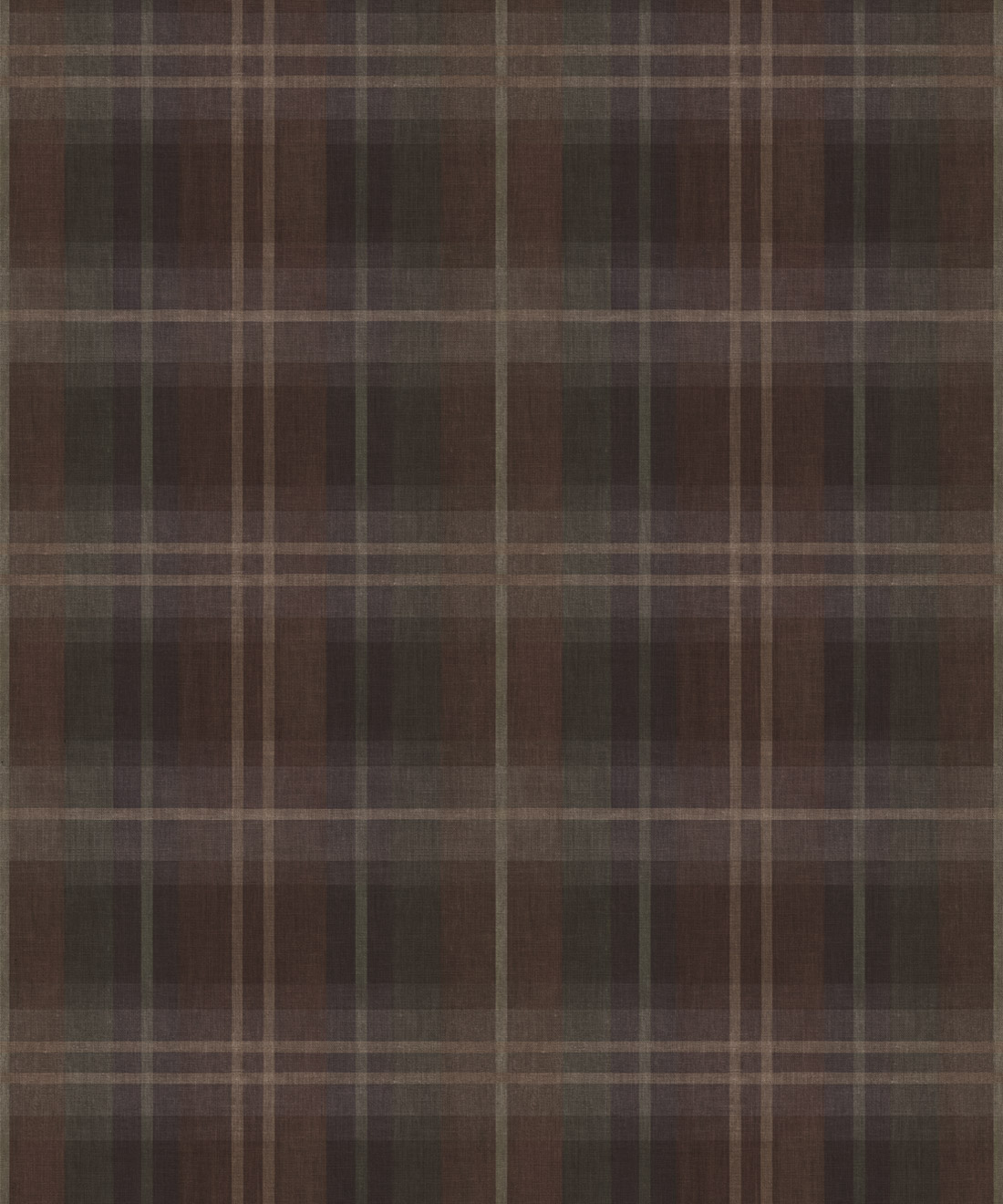
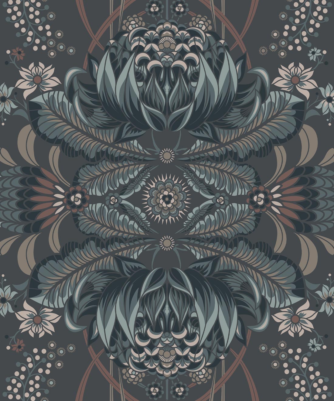
Let’s look at some gorgeous compliments to Behr’s Flagship Color for 2027.




To dive deeper into more color pronouncements, check out Glidden’s “Artifact”, C2 Paint’s “Pueblo” and Valspar’s “Cottage Door”. They range from blues to blushes and everything in between. Which hue speaks to you? The important thing is to make sure you give your home a cohesive look that rings true. Wallcoverings and fabrics can really help integrate those paint colors into your space, extending them from the walls to the windows. Browse Milton & King’s versatile collection today!